I am a total nerd when it comes to compositional theory, and one of the things that drew me to food photography in the first place is the gorgeous colours that we see present in all types of food.
(And you’re probably going to guess what I say next)… So it’s not surprising that I dig Colour Theory. I love Colour Theory in food photography.
I think it’s so powerful.
If you’re asking what Colour Theory in food photography is, then get excited because we’re about to explore it and what my favourite way to use it is.
What Is Colour Theory?
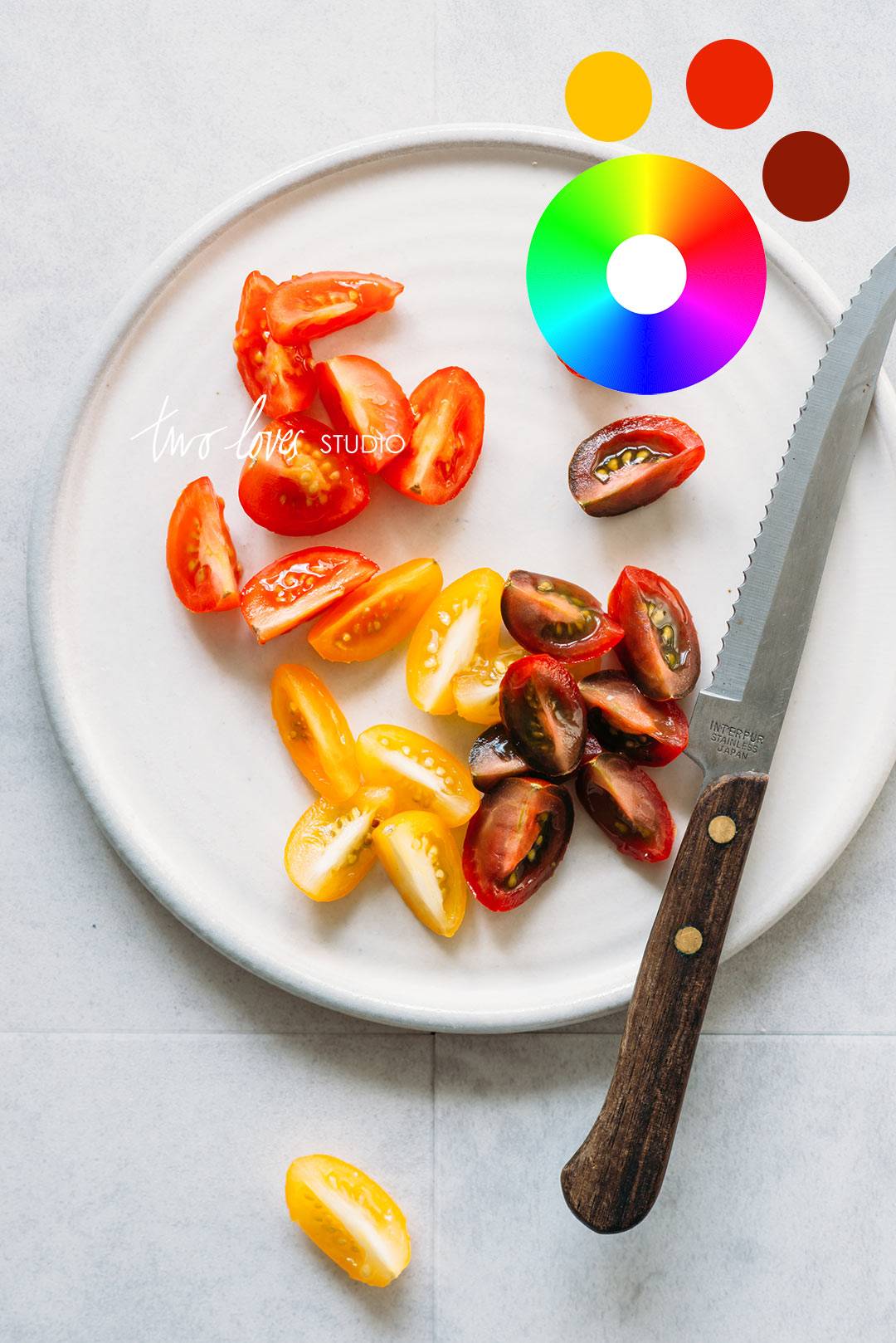
Colour Theory is a set of practical guidelines on how to mix colours and the visual effects of colour combinations. Colour Theory explains why certain colours have given sensory experiences and are aesthetically pleasing.
Colour theory is a visual design element that we can use to create interest in our image.
The common types of colour pairings in Colour Theory in food photography are:
Analogous Colours, Complementary Colours and Monochromatic Colours.
All of these colour pairings, (and the others that I haven’t mentioned here) can be found on the Colour Wheel.
The Colour Wheel is a visual representation of how colours are organised by hues and shows the visual representation between primary, secondary and tertiary colours.
Why Is Colour Theory in Food Photography Important?
Different colours evoke different moods and emotions. So it’s important to understand how the use of colours in our images allow our viewer to connect with the story we are telling, (which is btw, is the whole goal of composition).
Colour theory is a visual design element that we can use to create interest in our images.
This is so crucial in food photography as the colours in our food and recipes say a lot about how the food will taste and helps us to decide if it’s a recipe we’re willing to make.
Calling our viewer into action to save, make and serve the recipe!
My Favourite Way To Use Colour Theory in Food Photography
There are a couple of ways you can use Colour Theory in food photography, and how we use it will depend on our style and the types of food we’re shooting, but….
When I have the choice, I have a ‘go-to’ set of colours that when I shoot them, it really feels like my work. It makes me smile inside, like a little victory each and every time.
‘So just tell me already’…I can hear you say. Well, my favourite way to use Colour Theory in food photography is:
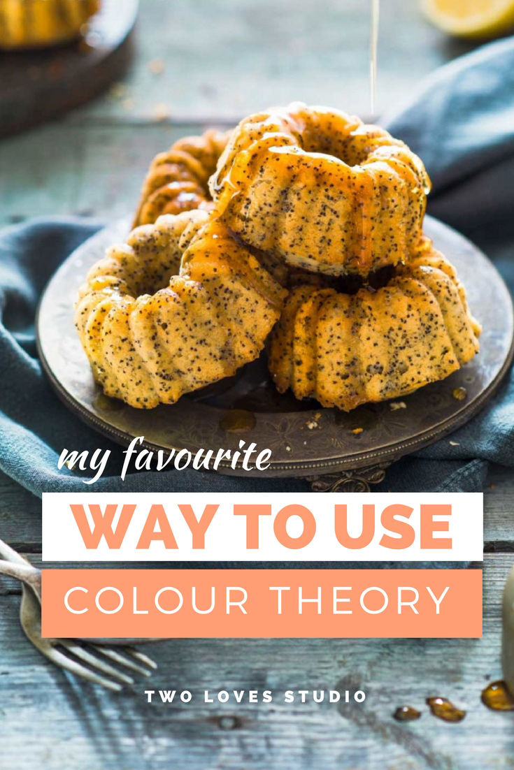
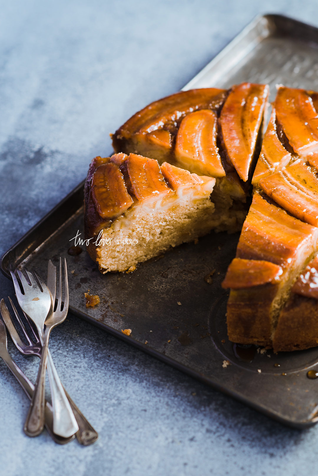
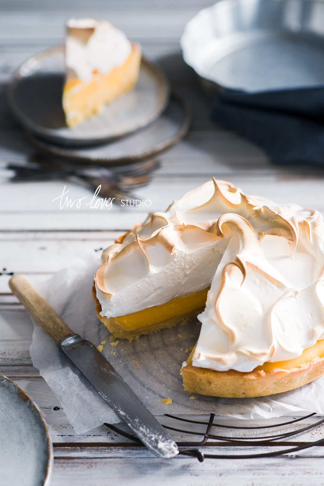
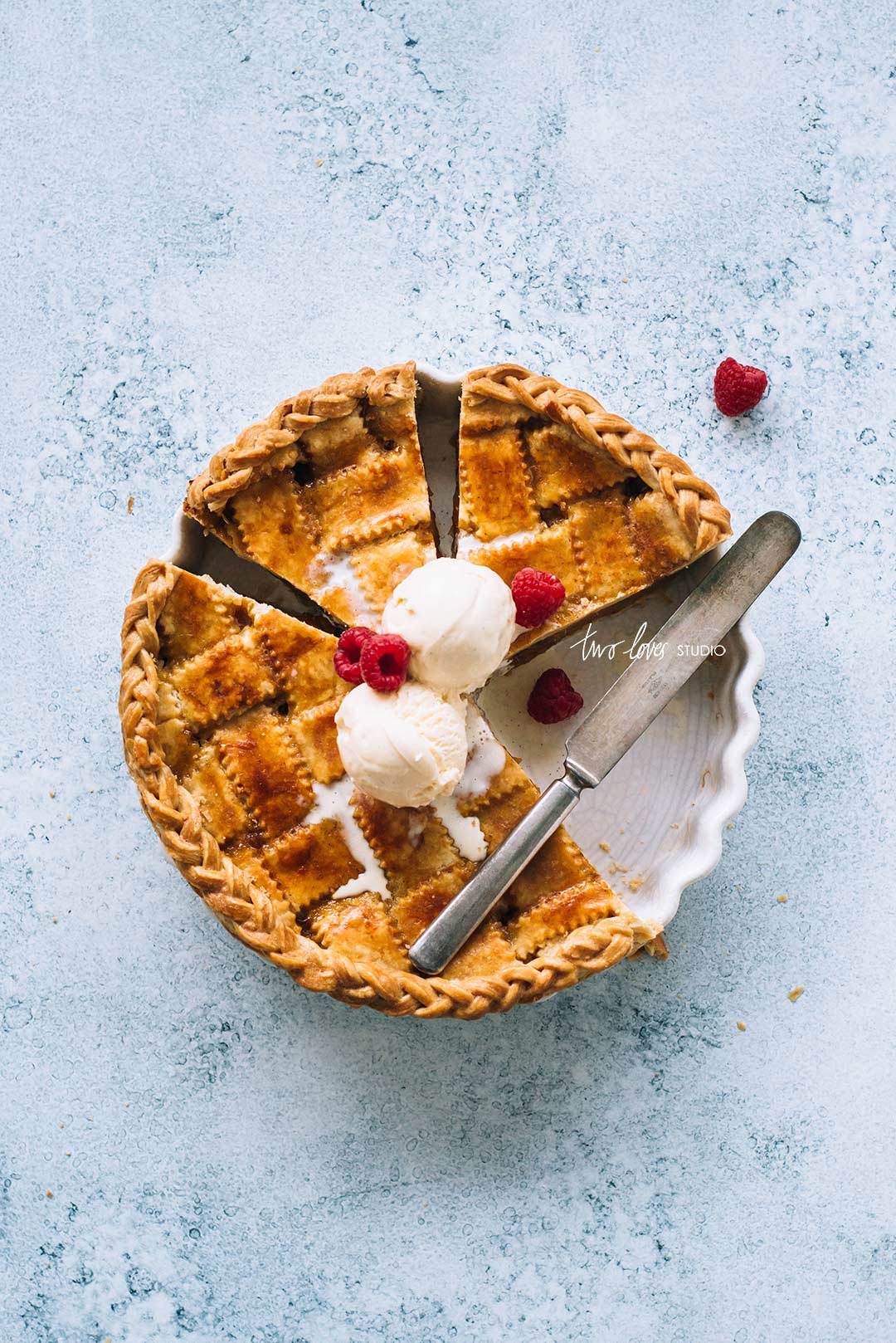
Complementary Colours that are a warm and cool, primarily the mix of orange and blue hues.
Why Do I LOVE This Colour Mix
As I mentioned, colours evoke different feelings and emotions.
Blue hues have a calm, crisp and fresh feeling, which I think pairs really well with food photography. After all, we want our food looking (and feeling) super fresh!
Orange hues have a feeling of warmth and comfort. BUT together, the dream team of complementary colours that are orange and blue, create a sense of movement.
This is because cool colours appear to recede and warm colours appear to move forward. This adds an additional layer of contrast and movement.
This helps me to boast simple composition.
I tend to shoot simplistic or minimalism when it comes to food photography, so I focus on powerful yet subtle composition techniques.
How To Use Colour Theory in Food Photography
I hope this post blew your mind and introduced you to some exciting new concepts that you can try with your food photography. I know it totally blew my mind when I was studying it.
Finding a combination of colours that really felt like ‘me’ and matched my style was like finding a golden ticket. It opened up so many new ways of shooting for me.
While there are a number of ways you can use Colour Theory in food photography, why not give Complementary Colours a try.
To do this, you simple create colour contrast in your image by using colours that are on the opposite sides of the Colour Wheel.
So like Blue/Orange as I mentioned, Red/Green is another common combination, plus Purple/Yellow. Depending on what hue and luminosity you’re using, there are all types of hues and tints that you can use within the wheel to personalise your colour choice.
The key, and the important thing to remember is that balance is the key.
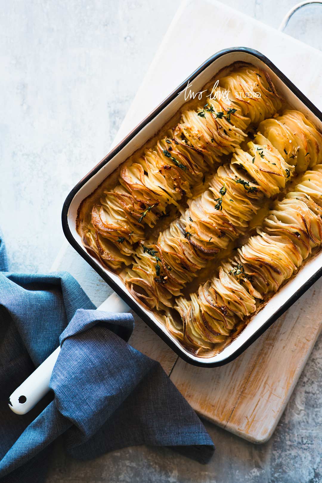
Colour should be used to enhance your image, rather than distract. A tip is not to use too many hues, which is why using complementary colours works well, as you will follow opposite colours on the colour wheel rather than just any hue!



Asmita BD
Amazing post!!! Thanks for shedding light on colors and their theory ??
Rachel
How cool is it! You’re so welcome.
Midori
Thanks for explaining this! I’m definitely going to use this theory next time! I’ll even print a color wheel and keep it handy!
Rachel
Great idea! It’s super handy when trying to pick complementary colours. Let us know what you end up going with in your next shoot!
Adrienne
Neat post. Will need to give this a try. Thanks!
Rachel
Awesome Adrienne! Glad you enjoyed it.
unique valentine's day gifts
My spouse and I stumbled over here from a different website and thought I may as well check things out.
I like what I see so now i’m following you. Look forward to exploring your web page for a second time.
Rachel
🙂 So great to have you here.
Janice - Salads for Lunch
Thank you! I struggle with making orange foods look appetizing, pairing with a blue hue is a great idea, thanks!
Kacie Morgan
Just stumbled across your post while searching for some food styling insp for a recipe I’m shooting tomorrow. Great read – signed up for your course. Thanks! 🙂
Rachel
Hey Kacie! Welcome to the community! Excited to hear you got some tips for an upcoming shoot. Enjoy the course 🙂
Hydrogen Executor
Hydrogen Executor brings a whole new level of excitement to the Roblox experience. Its innovative features redefine gameplay, making it a must-try for all Roblox enthusiasts!