Photographing color in food photography used to be a challenge for me. I was scared of using bright colors as it often looked like a dog’s breakfast.
We all know that when it comes to food photography, color is very important and appealing! I’ve discovered a few secrets that are a must when shooting color confidently! Quickly, they are:
- We need to use color theory to create harmony.
- Use color contrast and soft light if you’re new to photographing color.
- White balance also affects colors, not just whites.
- Choose creatively you’ll approach colored shadow and highlights.
- Desaturated colors are just as powerful.
Let’s take a look at some of those tips so you can get color happy!
To Create Color Harmony, Rely on Color Theory.
It’s very easy to get lost when it comes to photographing bright colors. We mostly shy away from using anything to crazy or colorful, but the problem isn’t the color.
It’s how we pair or use our colors together.
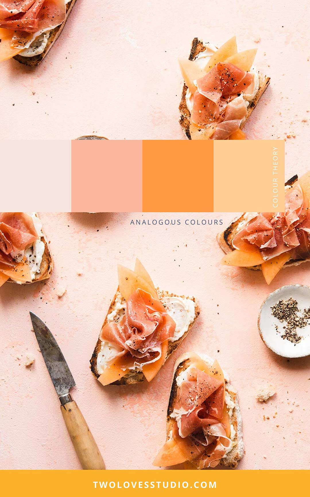
Color Theory is a set of practical guidelines on how to mix colors and the visual effects of colour combinations. Color Theory explains why certain colors have given sensory experiences and are aesthetically pleasing.
When we are using bold colors to photograph food, we need to think firstly about the color of our food. Then by using different types of Color Theory, we can start to pair ingredients, props, backgrounds and other supporting elements in a way that feels harmonious.
Basic Color Theory pairings can be:
- Monochromatic
- Analogous
- Complementary
For more advanced Color Theory, enrol in my Composition Essentials masterclass.
Pick the type of Color Theory you want to use, then start to pick props, create a background and source ingredients in that color palette.

Use Color Contrast & Soft Light if You’re New to Photographing Color.
Light is everything in photography and a lot of times light with a lot of contrast catches our attention more than very soft light.
But super soft light can really work when you are shooting lots of color, and especially when working with brightly colored backgrounds.
Soft light can ‘soften’ our colors and make them inviting. You don’t always need to shoot color with soft light, but it’s an easy choice if you’re new to exploring color.
Colored shadows will also be less pronounced with soft light if that’s an annoyance you have (we’ll cover this later).
Soft light helps us focus on color contrast and ‘feel’ each color. I don’t tend to use very soft light much in my food photography outside of shooting lots of color.
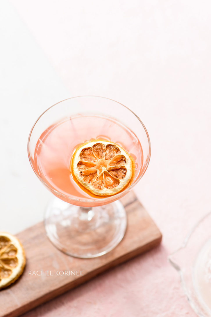
White Balance Also Affects Color.
White balance doesn’t just affect whites, it also affects how colors show up in our photos.
It’s therefore important to make sure we are correcting our white balance to suit the colors we are shooting. It’s not enough to just use the eye-dropper tool once and hope for the best.
In actual fact, just using the eye-dropper tool is holding you back as you’re basically letting your RAW editor decide color correction for you.
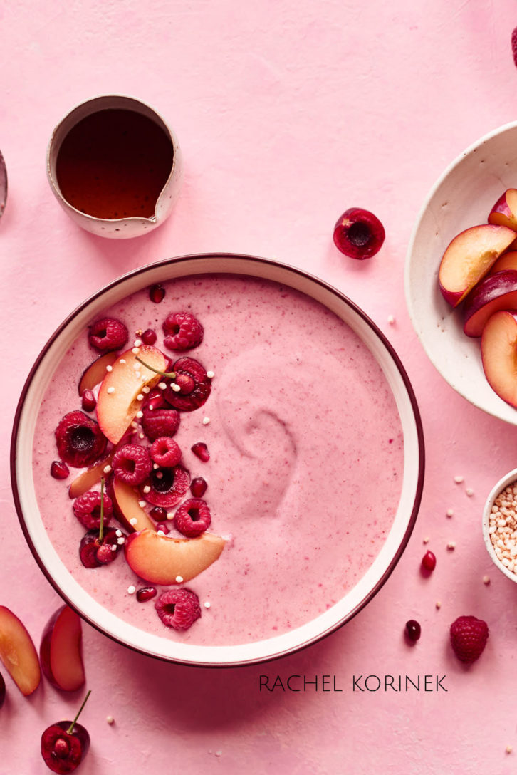
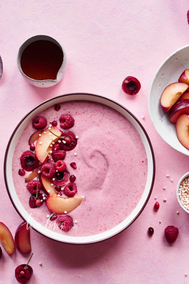
If you take a moment to ‘feel’ the shots above, the warmth of coolness of each photos brings a different meaning to colour.
How to Approach & Correct Colored Shadows & Highlights.
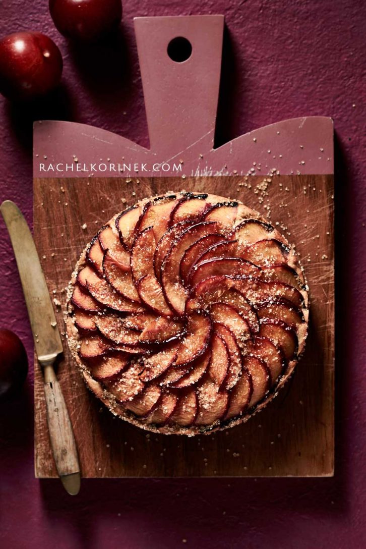
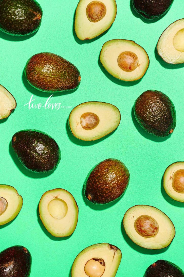
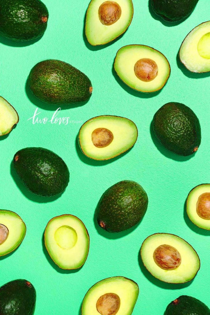
My biggest annoyance when working with brightly colored backgrounds is they result in colored shadows and highlights/reflections.
Colored shadows or highlights are inherently good or bad. They are just part of photographing color.
How you deal with these problems creatively, is up to your style and your creative vision.
Here are some ways you can think about these areas in your photos:
- Create deep and darker shadows that look more black than colored.
- Shape soft and airy shadows so they feel less noticed as being colored.
- Retouch colored shadows & highlights to your liking (something I teach how to do in Retouching Food Photography Masterclass).
Let’s look at some examples here.

Don’t be Afraid to Desaturate Color.
The cliche ‘less is more’ couldn’t be more true when it comes to color.
Creating and sharing work on Instagram for years now, has led me into a lot of insight on what others find ‘colorful’.
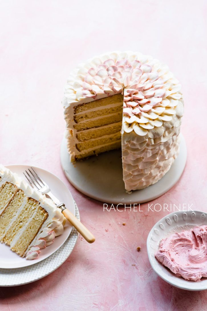
Colorful doesn’t equal lots of color, or even bright colors.
Colorful is harmonious and pleasing. This includes adding different hues of color and even desaturating some colours.
Think about which color is the ‘hero’, or the ‘star’ of your photo. Do the other colors feel harmonious, or do they compete? What happens if you paired a desaturated color? Or desaturated the color in post-production?
I hope this post have given you some tips to think about when you next integrate bright colour in your work!


Tina
Great tips Rachel! Always love reading your newsletters!
Rachel Korinek
Thanks Tina! So grateful to have your support on the blog 🙂
Trish Evans
I really enjoyed this article, great tips
Rachel Korinek
Thank for reading Trish! So glad you enjoyed it 🙂
Marie
Great tips as always Rachel. I always find yellow is the hardest thing for me to shoot and colour correct. Do you have any ‘yellow specific’ tips.
Rachel Korinek
So glad you enjoyed it, Marie! Most colour I find will always fall into these tips. Yellow is the same as pink for me. I shot yellow a couple of times in the last month and I came up against the same things. I would try to think about the tips as you work with yellow again and see if that helps. One thing to keep in mind with yellow is that it’s part of temperature in white balance, so you might need to add some ‘blue’ in your temperature sliders if it feels too warm for you.
Ashley Madden
Great post Rachel! I think I need to revisit some basic principles! I’ll be rewatching some of you Lightroom Magic lessons for sure 🙂
Ashley
Andrea
Wonderful advice, as always. Thank you, Rachel!
Rachel Korinek
So glad you enjoyed the post!
Asmita Bharadwaj Das
Loved all your tips. Less is more for sure!
Rachel Korinek
It sure can be. The trick is knowing that. Thanks for reading 🙂
Charlotte Holinier
Thanks for the tips Rachel! I might actually try to play with colours a little more in my photography 🙂
Rachel Korinek
Ah so exciting! I hope you do. Make sure to post a link so I can see your shots xx
Nandita
Great tips Rachel! You always give us new angles to think about in food photography 🙂 Thank you!
Rachel Korinek
So glad to hear that! Something to practice this summer x
Megan Morello
Hey Rachel,
Thanks for the tips. I always learn so much from your posts and look forward to them in my inbox!
Rachel Korinek
Ah thanks Megan! So glad to hear that. I love writing on the blog.