New to color theory? Check out our basic color theory post before reading the below.
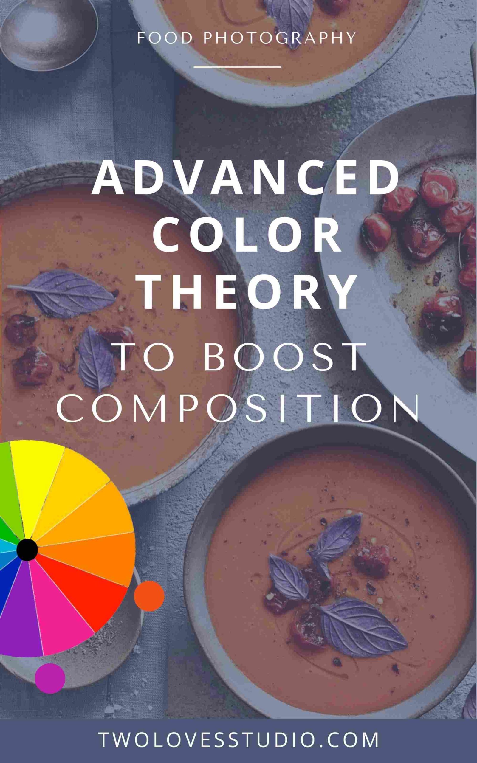
In this post about advanced color theory, we’re going to take a look at how I use three advanced color theories in my food photography and show you how you can too.
Now, just remember when it comes to color theory in food photography, it’s all about creating visual interest and harmony in our work.
Now let’s jump straight into our first theory!
The 3 Advanced Color Theories
To jump straight to each advanced color theory, click the links below.
Advanced Color Theory: Split Complementary
Split complementary colors, is a more advanced take on complementary colors. It allows us to be a little more flexible by adding in a third color to our palette.
I cover complementary colors in my basic color theory post, so be sure to check that post out before reading on if you are new to color theory.
So when we’re looking with complementary colors, we’re looking at colors on the opposite side of the color wheel. So split complementary colors is gonna take it up a notch.
Instead of just using orange and blue, we’re going to anchor our color at blue, and then we’re going to use two colors on the opposite side. So this might be using a combination of yellow and orange. We’re not looking directly at the opposite anymore. We’re looking at the two adjacent colors opposite to the first color.
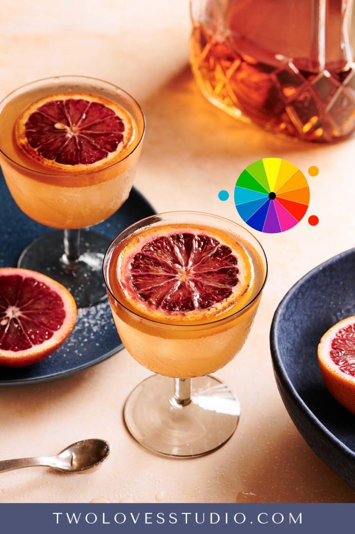
Let’s talk about this whiskey sour shot with a brûléed orange on the top. I’m using split complementary colors of blue and anchoring it with those adjacent colors on the other side of the color wheel, which are orange and red.
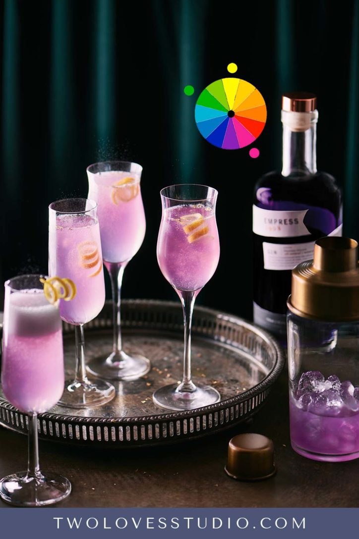
Another example of advanced color theory would be to use pink, yellow, and green. In this French 75 cocktail, we have a beautiful pink bubbly cocktail with a gorgeous yellow garnish paired with a nice green velvet for the background.
Tip: Split complementary colors are really useful when you’re trying to think about three colors that you want to pair.
When we’re new to advanced color theory we can get hung up thinking we can only use combinations like blue and orange together. But if you think about it, sometimes orange, yellow and red sort of blend into one another.
This would be when implementing split complementary can help us wrap our heads around the variations of colors that we have in food.
Triatic Advanced Color Theory
Here we’re using colors that are spread evenly throughout the color wheel. Think about an equilateral triangle, if you could remember all the way back to high school, we’re going to be using that triangle within the color wheel to pick three colors that are evenly distributed.
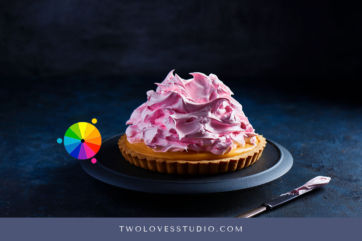
An example of that would be blue, pink, and yellow. Here I have used that in this beautiful pink lemon shot. So we have a beautiful pink meringue with a lemon. It was just really easy to think about this particular color palette and pair it with a blue background.
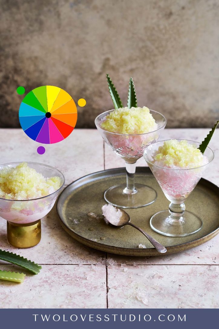
In this frozen cocktail photo, I used a combination of purple green and yellow distributed evenly throughout the color wheel. That really helped me pick a garnish that was going to work within color theory and make everything look harmonised.
#3 Diad Colors – My Favorite of The Three
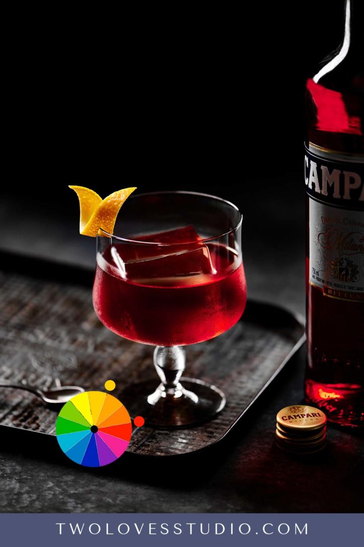
This is one of my personal favourites. When it comes to advanced color theory, I like to go down the road of less is more, and I love to focus on two colors and really make them shine. So this is where I use diad colors.
With diad colors, we are looking at colors next to each other on the color wheel, but that are separated by one color.
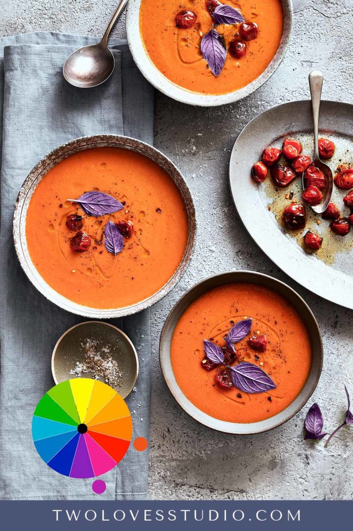
An example of the difference between diad and analogous colors would be red and yellow. In this Negroni shot here, I’ve paired this gorgeous red liquid with a yellow garnish and it just works so well together.
If you’re really struggling to think, how do I pair two color? Using the diad color theory is a really good choice.
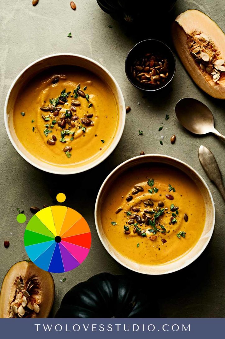
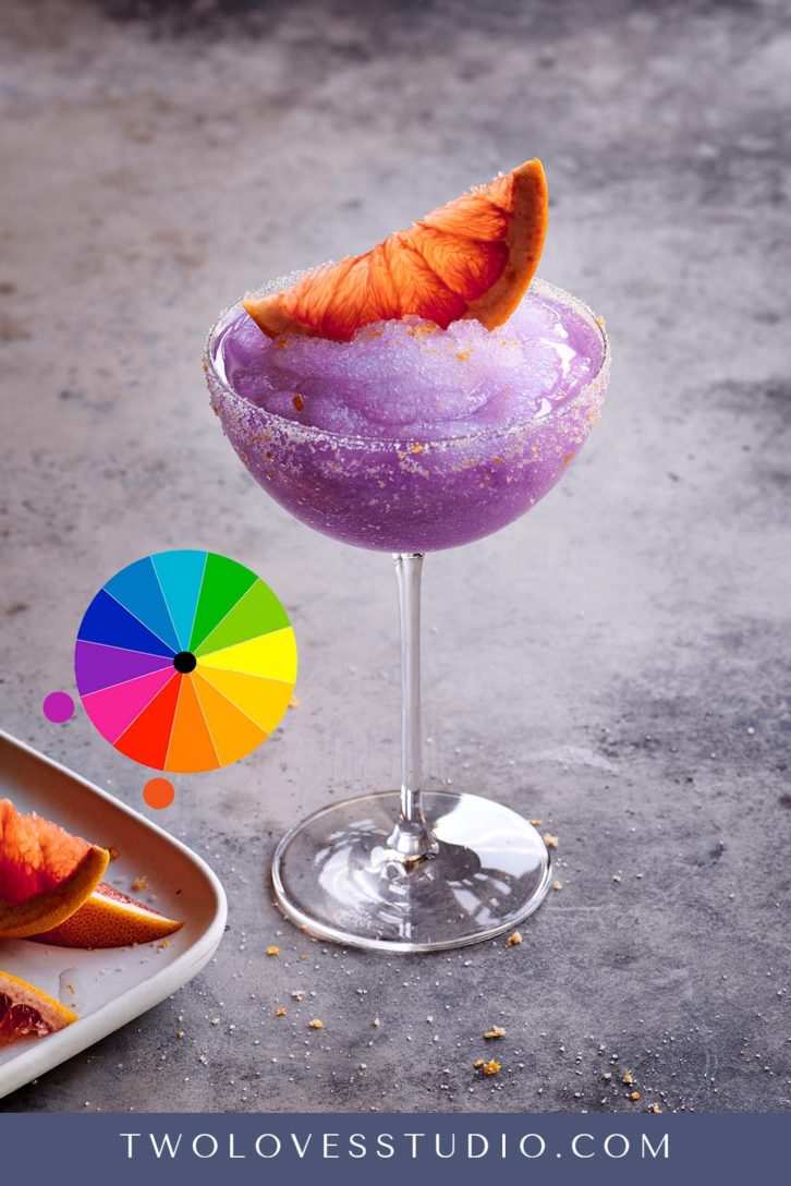
I have often used purple and orange colors together. I never thought that I would use those two colors together, but they actually work really well.
If we take a look at this frozen grapefruit drink here, I’ve paired the purple gin, with orange in the grapefruit slice here. When I created this photo, I wasn’t actually thinking about color. I was thinking about the ingredients and the taste. Was it going to match the color of the gin?
To learn more about color in Food Photography, check out my related blog posts:

