Throughout my years of teaching editing, I’ve found that color grading feels daunting for many photographers. In this post, I will share 3 simple ways you can think about incorporating color grading in food photography.
It’s definitely something that takes time to be done well, but most people just aren’t sure where to begin. I’ve created 10 simple Color Grading Adjustment Presets for Lightroom to help you dip your toe into the water!
What is Color Grading?
Firstly, let’s cover what color grading is!
Color grading involves adding colored tones to your shadows, midtones, and highlights—independently or globally.
It’s common in photography, videography, and film because it helps give an image (or video) a specific look and feel.
For example:
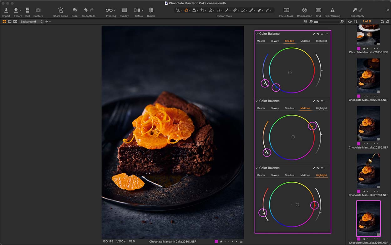
Add blue to your shadows, yellow to your midtones, and orange to your highlights without adding those colors anywhere else in your image for a creative look.
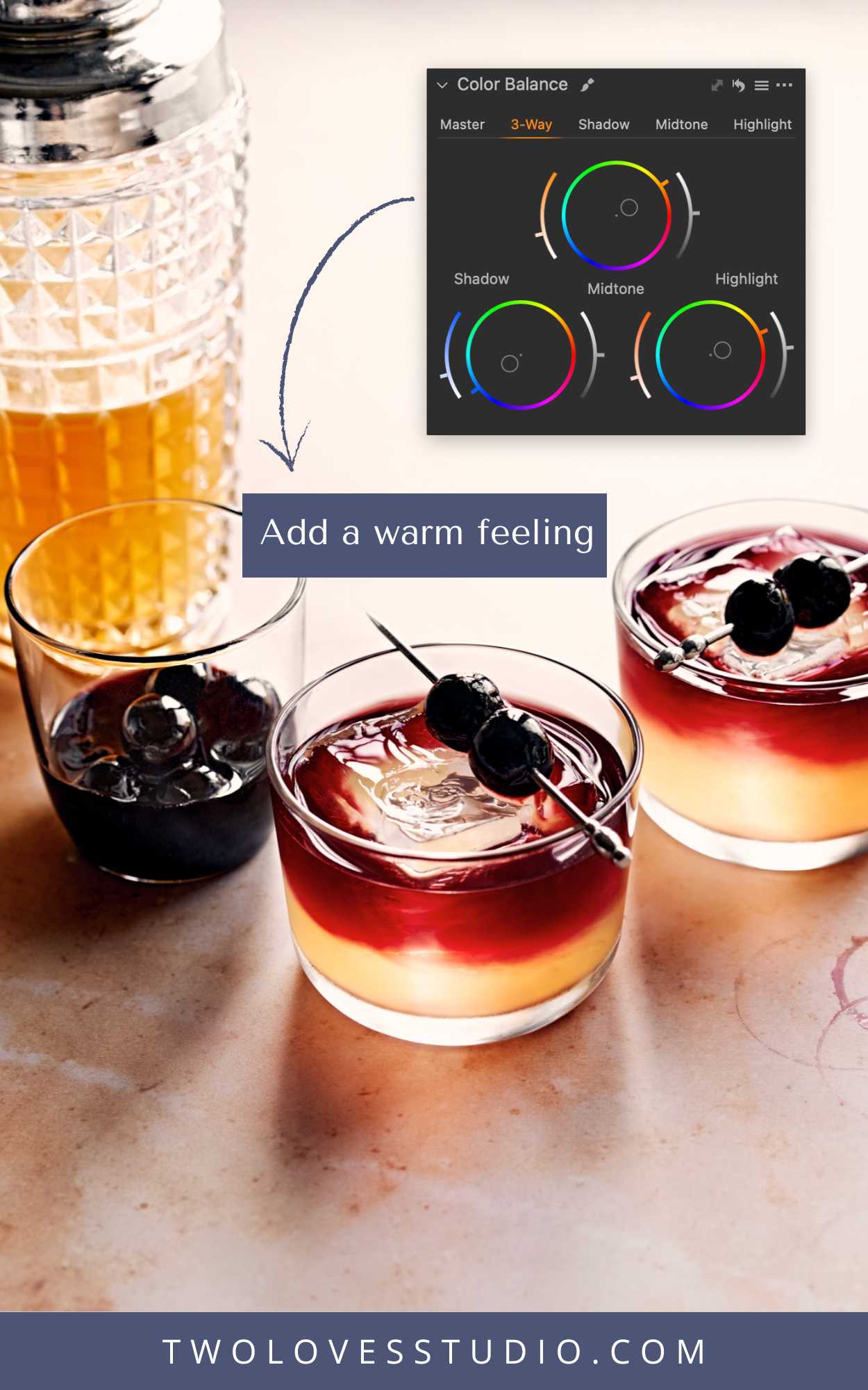
Add a golden-orange color globally—to all tones—to create a warm feeling in the image
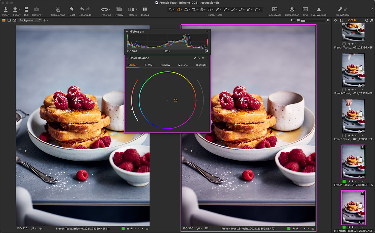
Color grading can be intense or subtle. In food photography, subtle is the way to go to add mood and emotion.
Color Grading Editing Tools
No matter what editing program you use, you’ll likely have access to color grading tools.
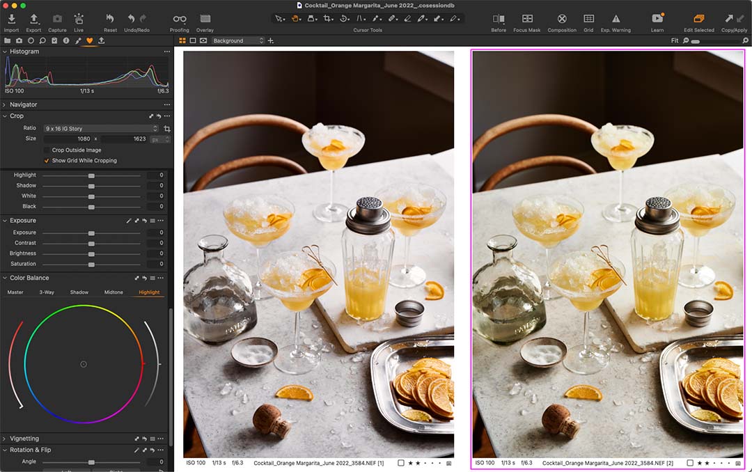
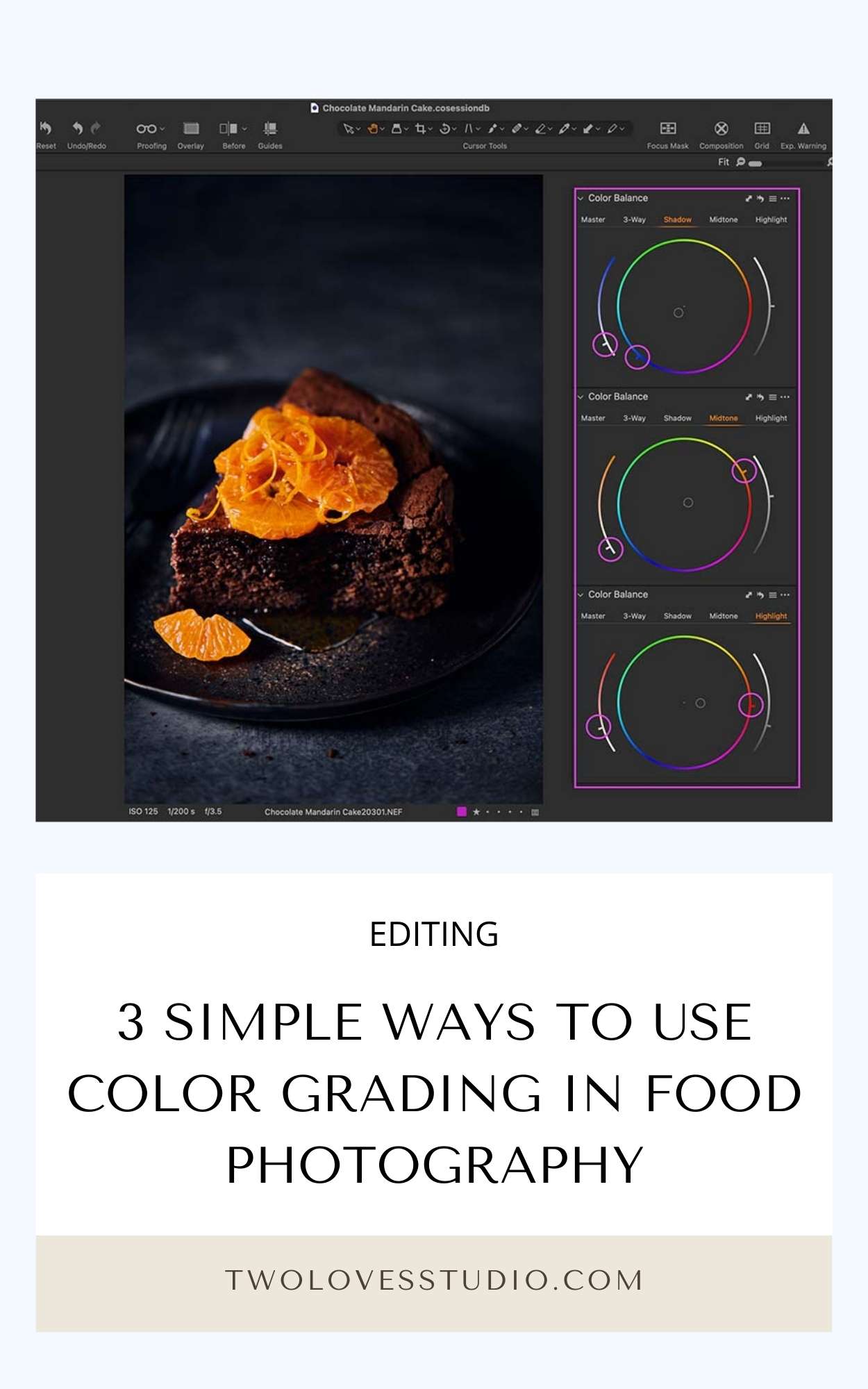
The Color Balance Tool in Capture One
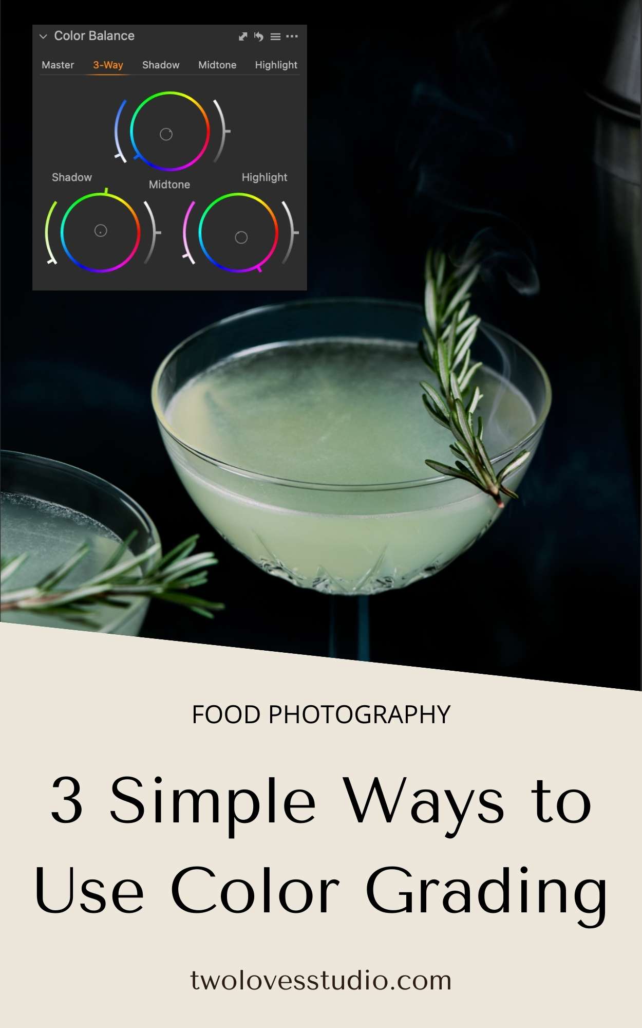
If you use Capture One, color grading is called the Color Balance Tool. It’s very simple to use. Simply select the Tone Wheel you want to add color to, (Shadows, Midtones or Highlights) and drag the middle cirle to the desired color.
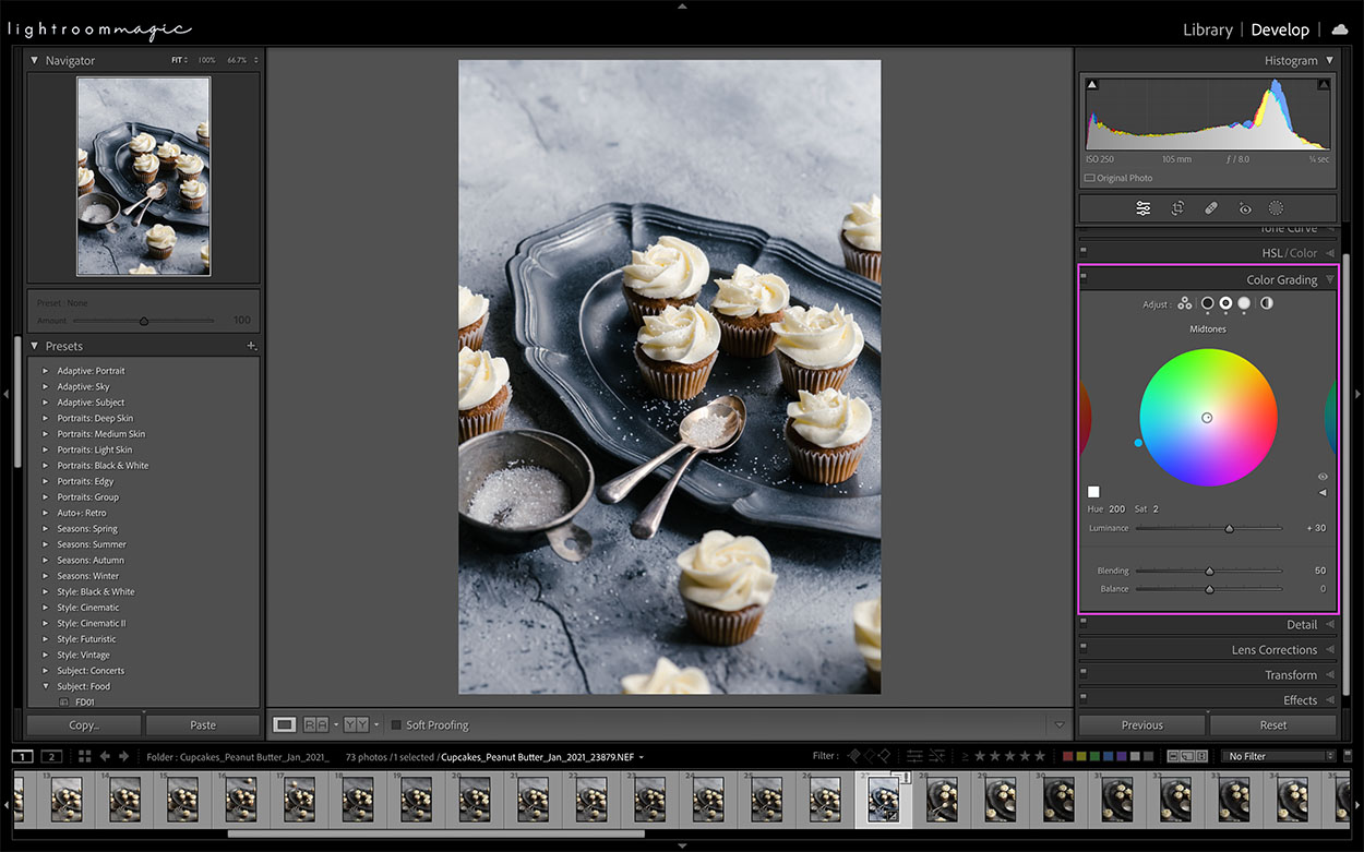
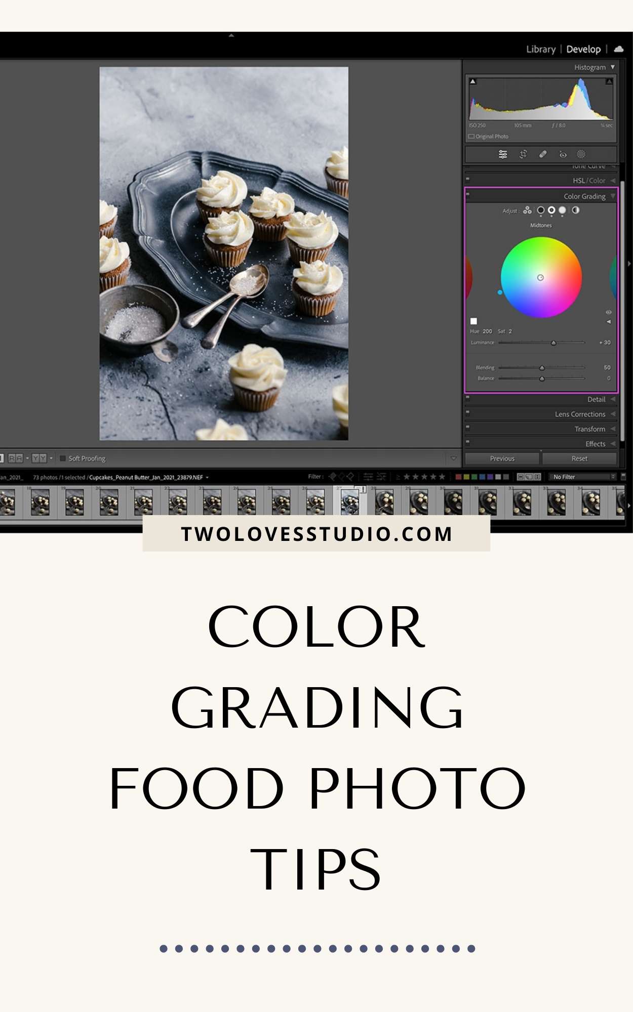
The Color Grading Panel in Lightroom
In Lightroom, you’ll find color grading in the Color Grading Panel with four sliders:
- Balance: Helps you balance the shadows, midtones, and highlights that you adjust
- Luminance control: Gives you control over the color correction of very specific tones in your image
- Blending: Helps you seamlessly merge all the colors you adjusted
Of course, it’s a little more nuanced than just moving some sliders around! To get to know all the ins and outs of these advanced editing programs, sign up for my Lightroom Magic or Capture One Magic course.
3 Simple Ways to Use Color Grading in Food Photography
Throughout my years of teaching editing, I’ve found that color grading feels daunting for many photographers. It’s definitely something that takes time to be done well, but most people just aren’t sure where to begin.
Here are some tips to help you get started:
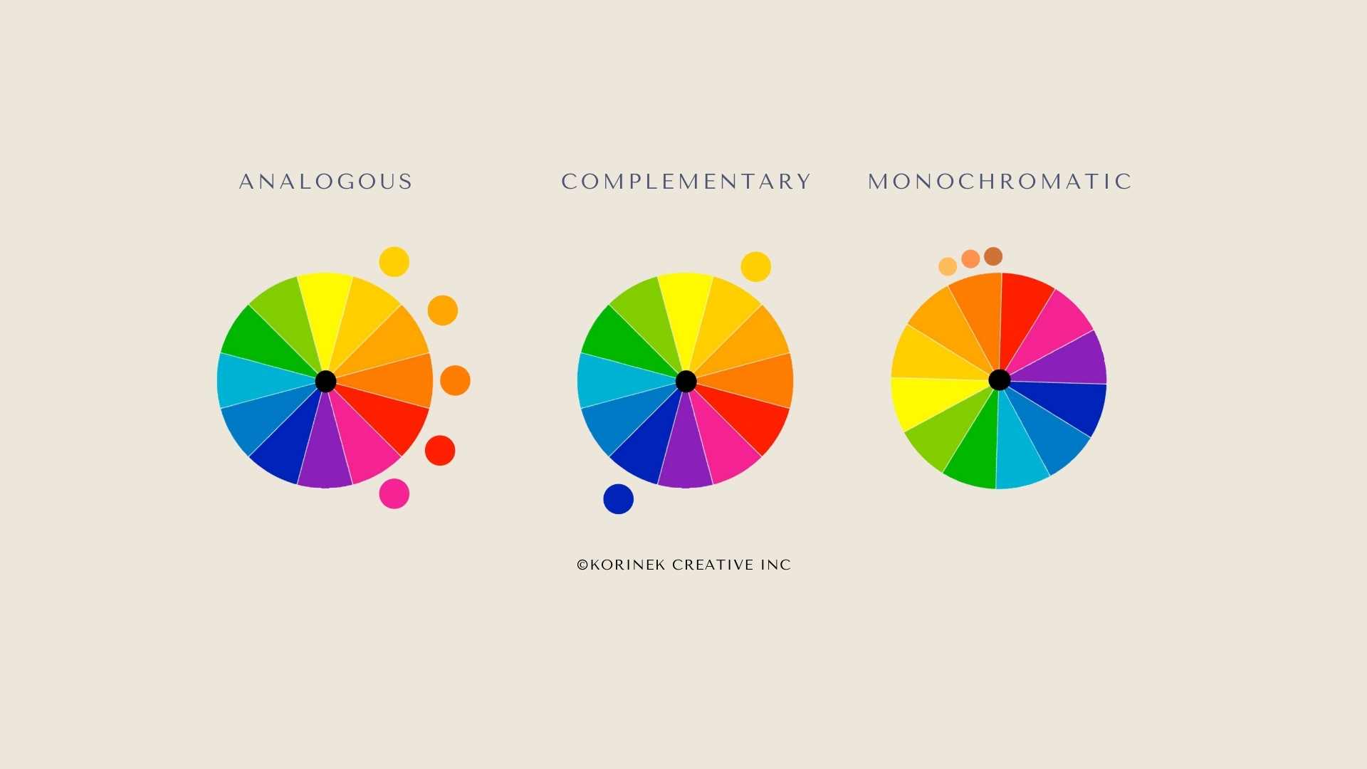
Use Color Theory:
Consider your analogous, complementary, and monochromatic colors when you’re deciding which ones to use for shadows, midtones, and highlights
Add Warm For a Comforting Feeling:
Warm colors like reds, oranges, and yellows will offer a warm, cozy, comforting feeling
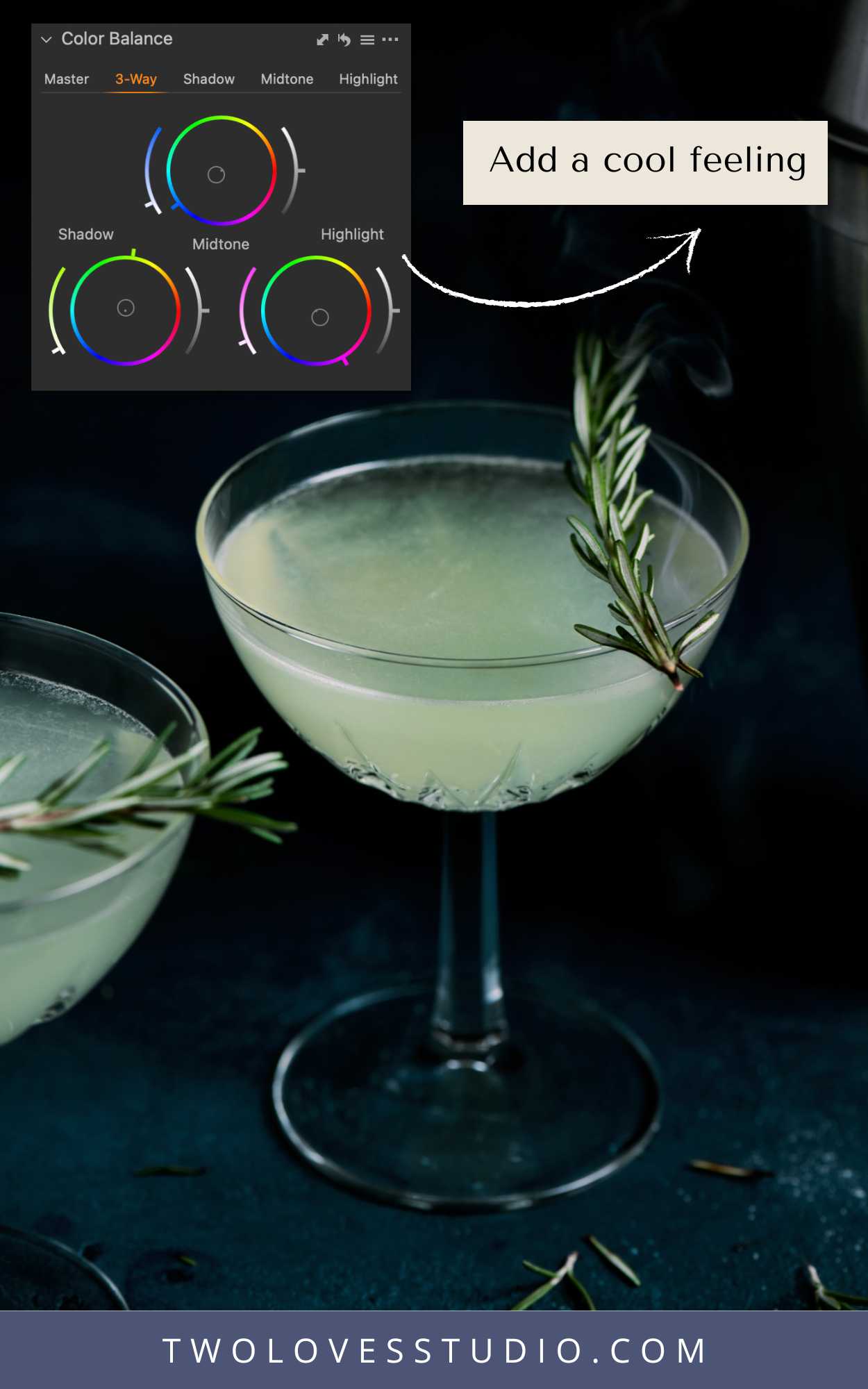
Add coolness For a Fresh Feeling:
Cool colors like blues, greens, and purples will make your image feel cool, crisp, and refreshing
Want to dabble in color grading for food photography? I’ve created 10 color grading presets to help you get started! They’re compatible with Lightroom Classic or Lightroom Mobile and include step-by-step instructions for easy installation.
Got color grading questions? Let me know in the comments below.


Amina
It was good and intresting
Hossain Ahmed
Thanks for sharing all this useful tips and insights.
Felix de Vega
Your blog is very interesting for all kind of photography, in my case, I don´t do food photography but wedding photography, and I find your content really useful, thank you