Accurate color is a huge topic of conversation in the world of editing and post-production. And rightfully so, it’s a complex topic.
Whether you are shooting for Instagram, your portfolio or clients, both editorial and commercial, accurate color rendering and editing is something you will want to think about.
The types of images you shoot and the clients you shoot for will influence how much about color editing that you’ll need to know.
In this post, I am hoping to open you eyes to the big and bright world of color. And would love to have you in my Masterclass, Lightroom Magic if you’d like to learn more about really making your images stand out.
Now, let’s dive into some things you need to know about accurate color.
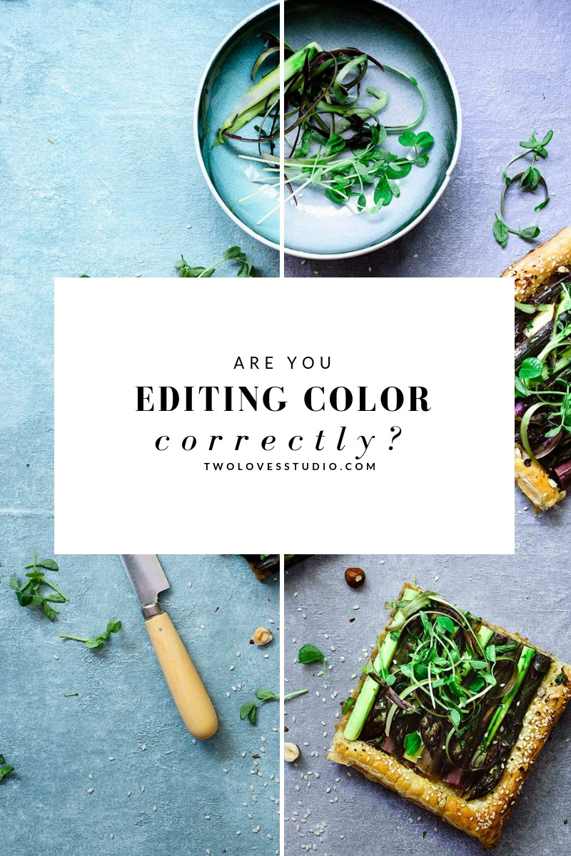
What Affects Accurate Color in Our Image?
There are a lot of factors that influence how our colors look in our images.
The type of lighting you use, it’s temperate and light source will change how your colors look. Even some directions of lighting, like backlight, will make colors appear differently.
File types can make colors look different. So a jpeg straight out of a camera, vs the processed RAW file. The type of camera, make, model, even brand. And the lens you use.
Any presets of the software you use to post-process can affect accurate color in our images as well.
Doesn’t that sound kinda crazy? It sure is. And that’s why calibration is important to understand as well as knowing how accurate color is rendered in the photographic process and how you can control this with editing.
What is Calibration And Why is it Important?
Calibration is is the process of matching characteristics of a device or devices to a standard. Imagine all the people in the view that view images and photos every day?
Why Instagram has over 1 billion users now.
So it’s probably no shock when I say now image all those different cameras, phones, tablets and computers that people are using to take their images on. Do you imagine that each device and each camera will take an image that produces the same colors?
So if we have billions of devices, viewing billions of colors, can you imagine that images and colors would show up differently on each? Of course.
This is where calibration comes in.
Calibration makes sure that we program our devices and cameras so that when our images are taken and viewed across devices, the colors look the same (or as close to as possible).
That’s important because you want the lemon filling in your lemon meringue pie to look just the correct shade of lemon as the food looks in real life. So by calibrating our devices to an ICC standard, theoretically your image should look the same on all calibrated devices.
But calibration goes deeper than that.
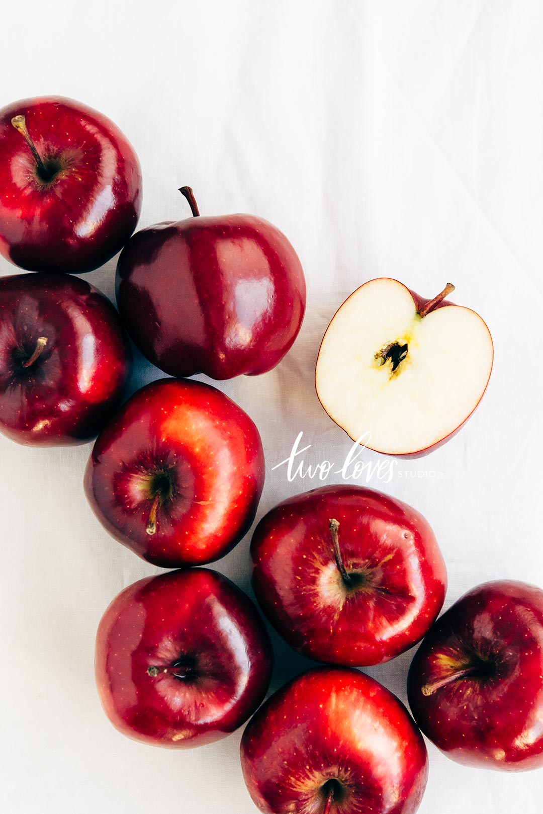
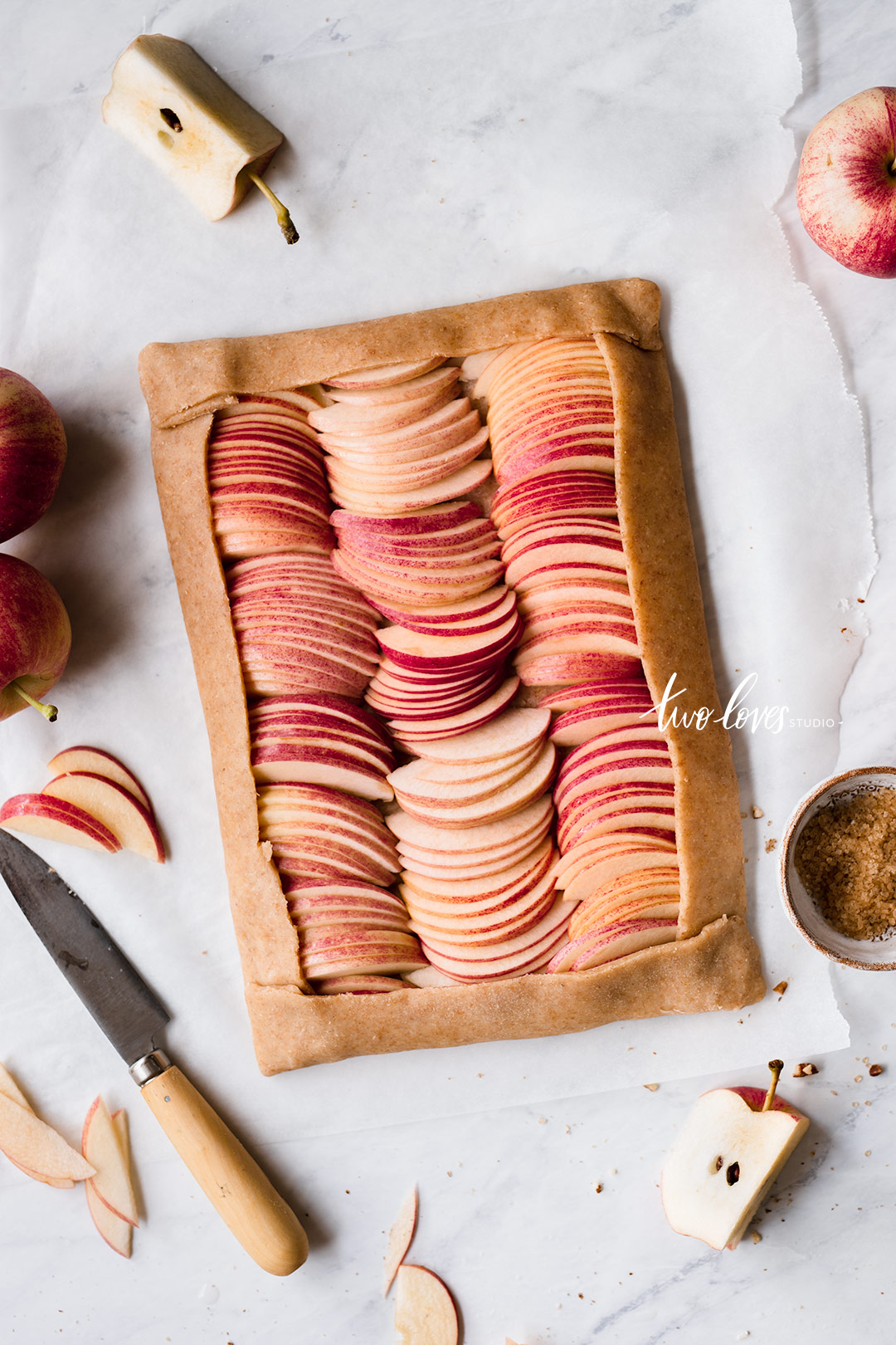
I mean, just think about all the different shades of red and pink we have in our apple varieties!
What is true blue? And Who Decides That?
Now colors and calibration and even trickier than making your lemon meringue pie look the same shade of yellow across all devices.
What is true and correct yellow? Who gets to decide what yellow is right or wrong. What shade or hue is a true yellow?
The problem is that we all see differently and interpret color differently. And that’s a problem when it comes to calibration.
Why I once had a great editing monitor made for calibration and photographers. I loved it, except for how it rendered oranges. For me, they just were incorrect. But I am sure not everyone had the same experience.
The way your camera captures color will also differ between brands. Nikon might decide that hey, this shade of blue is more correct.
And Canon might decide that something slightly different is true blue. So each camera will process your colors differently. This is why in most editing programs there is a calibration tab.
Where you have the control to change what you think is true blue or any other color for that matter.
Did this open up a can of colored worms for you? It sure did. Welcome to the world of calibration. A never ending discussion.
RELATED: Your Lightroom Food Photography Preset Are Holding You Back.
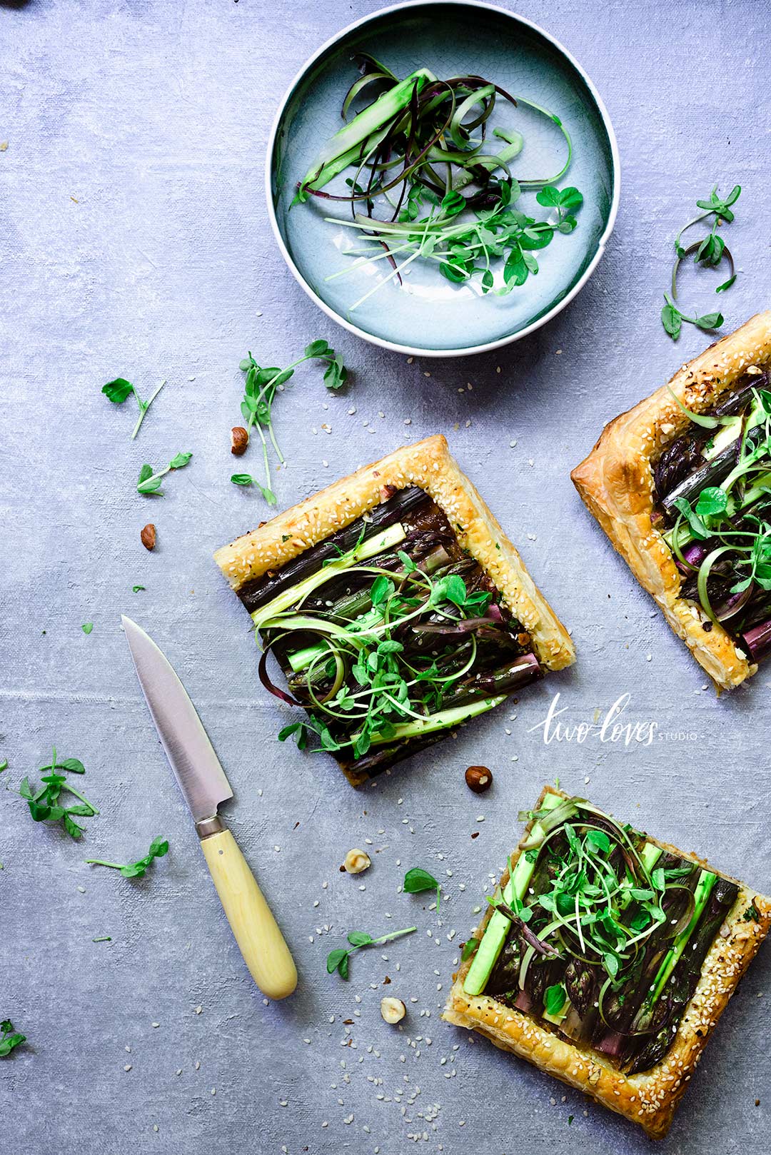
Editing Programs + File Types Decide How Your Colors Look.
An image is really a set of information contained in a file that gives us the final look. That information has to be processed in order for us to see the image.
That’s why we have different file types. When you shoot RAW files, we need an editing program to take that data and process it into our image.
As part of that, the data on color is processed to give us the colors that we see. So is it a good idea to let our camera or computers decide the colors for us? Well, the answer is yes and no.
If you have no clue what I’m talking about or where to start with color rendering, then yes. It can be helpful to have editing programs like Lightroom do it for you.
But it’s not as hard as you think.
People tend to buy presents because they are drawn to how colors and tones are used differently to create unique styles and moods.
Rendering of colors in programs is no different. It’s one of the ways that we get these signature looks.
A common complaint between Lightroom and Capture One in the past was that Capture One was superior in editing accurate color.
Since Lightroom released more color profiles and ways to control how colors are rendered that gap was closed. For me, I use both programs and while they render colours differently (hey calibration – that’s what we’re talking about), one isn’t superior in all cases.
I’ve found what is the most powerful is knowing how your colors act and are treated in editing. Then you have more control over our ‘true blues’ and ‘true yellows’.
(Side note for haters, each program does things the other can’t. They are both wonderful tools in allowing creatives to bring their art to life).
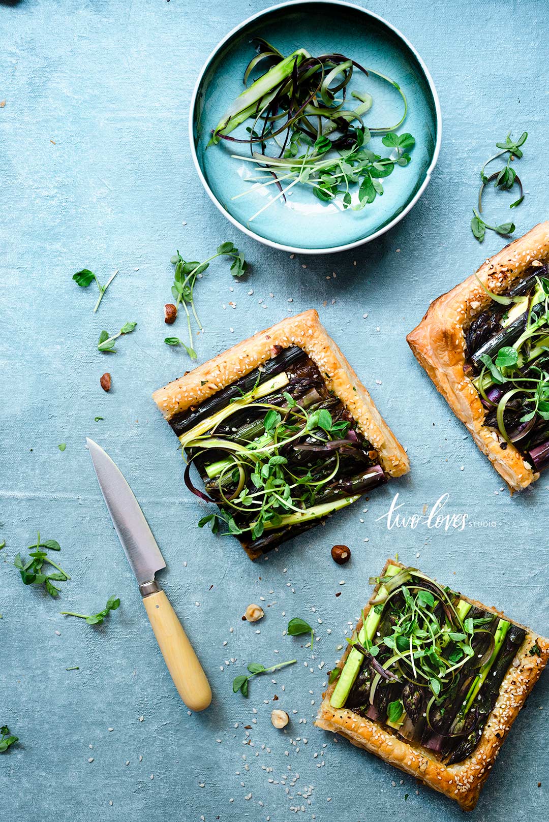
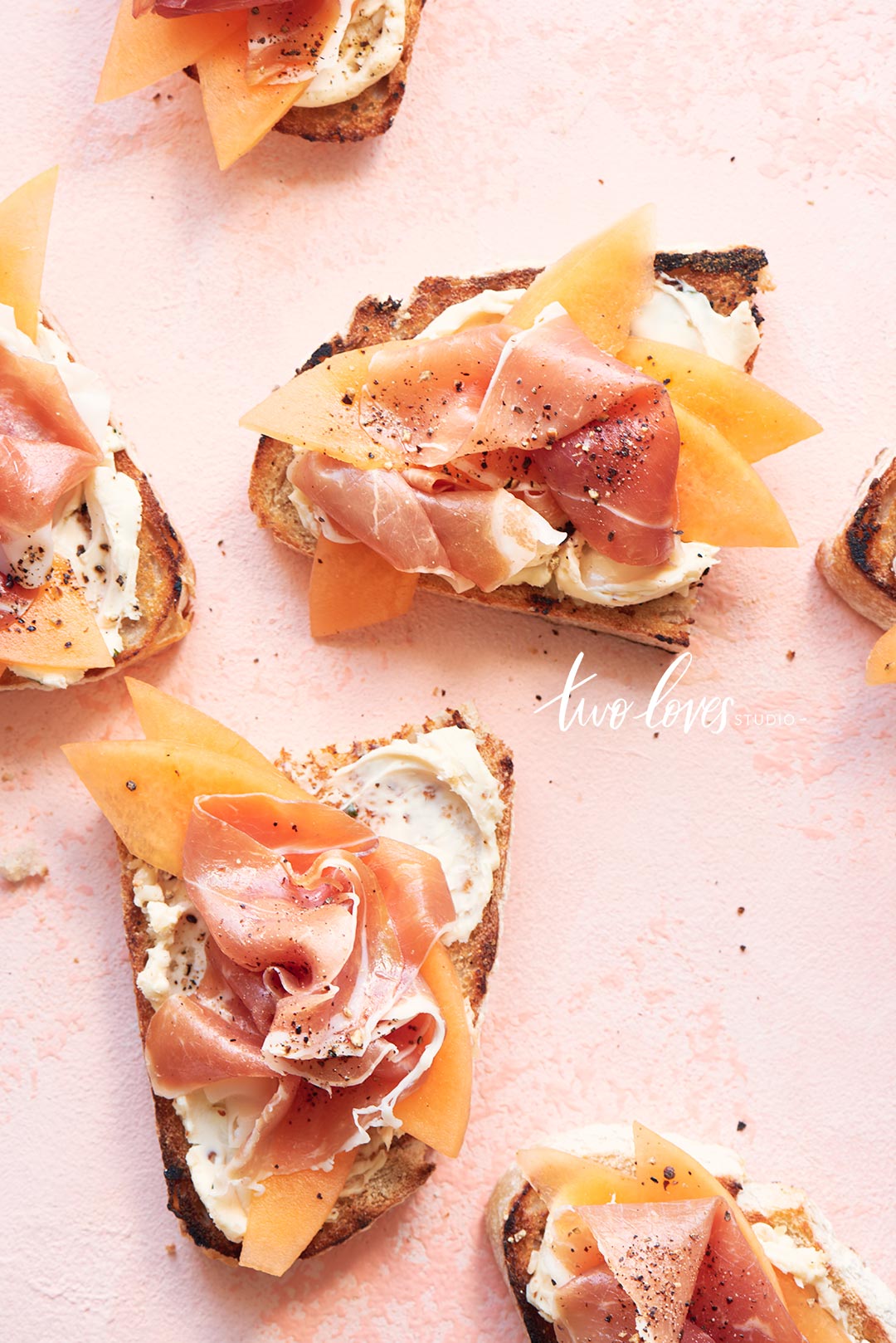
In the below images, you’ll be able to see slight differences in the orange and pinks. Not huge, but subtle.

Become a Walking Color Dictionary!
One of the biggest areas of opportunity comes from getting savvy with your definitions.
That’s why in Lightroom Magic I take you through all the definitions you need in post-processing and how to use them to find the tools you need to adjust your images. That’s where the power lies and it’s how I empower creatives to edit beautiful images and find their styles.
When you start to shoot more editorial or commercial work, especially in advertising, knowing the difference in color terms is important.
What are some examples of color terms? Luminance, vibrance, saturation, hue, tones, shades just to name a few.
Each one of these terms applies differently to different colors, moods and stories. Because food photography is so driven by color, it’s important to know which one will help you give the right story and evoke a certain nostalgia with your recipes.
More is less! That’s why designers get paid to play with colors.
Why when I went through a brand refresh, I had picked a really light subtle power blue. The designer revamped it a little to a slightly different HEX code and it all meshed so much better. These small differences are everything in food photography. Great photography is a lot of little things done well coming together.
That’s what my husband always says. And it’s so true.

Commercial Clients Eek!
Can you trademark a color? Yes, you can. In 2012, Christian Louboutin won the rights to trademark its red heels.
That doesn’t mean that they get to own the color red, that would be kinda of crazy, it means that a company can use a particular shade of a color or a combination in its industry.
So what else is red? Target, for example? Or even more famously Coca-Cola is red. It’s almost synonymous with the color.
What if you were shooting for Coca-Cola? Don’t laugh, it’s totally possible. It could even look like a sponsored post on social media.
Do you think they’d be ok with just any old style preset that you had? Most likely not. And the reason that is, is because they are very particular about the red that is their branding.
Therefore knowing how you can manipulate your colors in post-processing for our color dictionary terms, how calibration comes into play and how your editing programs like Lightroom, render your colors is important for every photographer to get accurate color.
These sorts of shoots tend to come when you’re least prepared.
Get ahead of the game by being empowered with my Lightroom Magic masterclass. It’s editing theory for food photography that translates into all other editing programs as each adjustment is tied back to three important, or core, editing aspects.
Grey Cards and Color Passports
There is a difference between good color and accurate color ~ Jeff Rojas.
True dat.
If you haven’t heard about these little gadgets, then let’s get acquainted.
A grey card is exactly what is sounds like. A grey card.
It’s the color of middle grey more correctly, which is what your camera’s meter is trying to calculate when it meters to exposure for a scene. When you use a grey card, your camera will ‘meter’ off it and you’ll get the correct exposure regardless of any tonal contrast in the scene.
Where color comes in is that it’ll help you to get accurate white balance. So a grey card will respond to the overall temperature and tint. It’s not going to adjust for or change any other colour in your scene.
And that’s where a color passport comes in. This comes with software that you use to analyse the correct and accurate color in your files and helps to create a custom profile for the camera, lens and lighting combination that you use.
This will then help you to render accurate colors to what they looked like in person.
If there is anything that you take away from this post, it’s that color can be complicated. But the best way to tackle it is to calibrate your monitor and understand how Lightroom is rendering (processing) your colors.
So next time you editing, think about how the colors are appearing for you.


Cindy Feingold
Rachel, is the Colour Passport used at the beginning of every photo shoot, or is it just done once. Not sure I quite understand this product.
Rachel
Hey Cindy! Thanks for stopping by. For sure. It’s quite a complex subject when you get into it. But essentials you’re making a profile here. You’ll know from taking my Lightroom Magic masterclass that profiles are what tells Lr how to render our data. So a colour passport will be used once in a photo, combined with software to create a profile. Hopefully that more sense and a topic for another blog post!
Cindy
Thanks Rachel. Appreciate your speedy reply as always. Do you ever sleep?? Haha!!
Rachel
Yes! 8 hrs a night. Just gotta make the other 16 count 😉
Alex Smith
Christian Louboutin won the rights to trademark its red HEELS, not “heals”.
I can’t take someone seriously as an instructor when they speak just one language and can’t spell something so basic correctly.
Rachel Korinek
Thanks for letting me know, Alex.