A Food Photography Critique could just be one of the most powerful ways for you to get those killer tips you need to take your food photography up a notch!
In this post I am going to share with you 5 TIPS to improve your food photography game based on BOTH the mistakes I have made along my journey and the MOST COMMON areas of opportunities I see when critiquing the work of other creatives.
I’ve got both a case study on my work from the first four years of my journey AND a food photography critique video from creatives in our community who went their work in to get some personalised feedback.
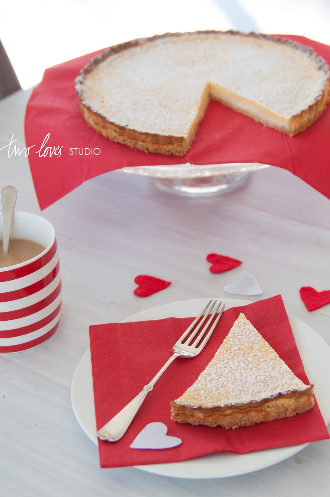
From this…
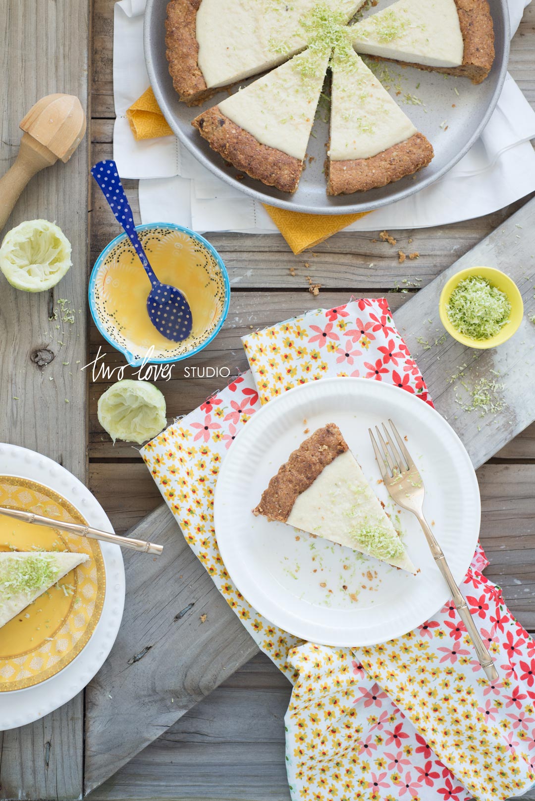
To this…
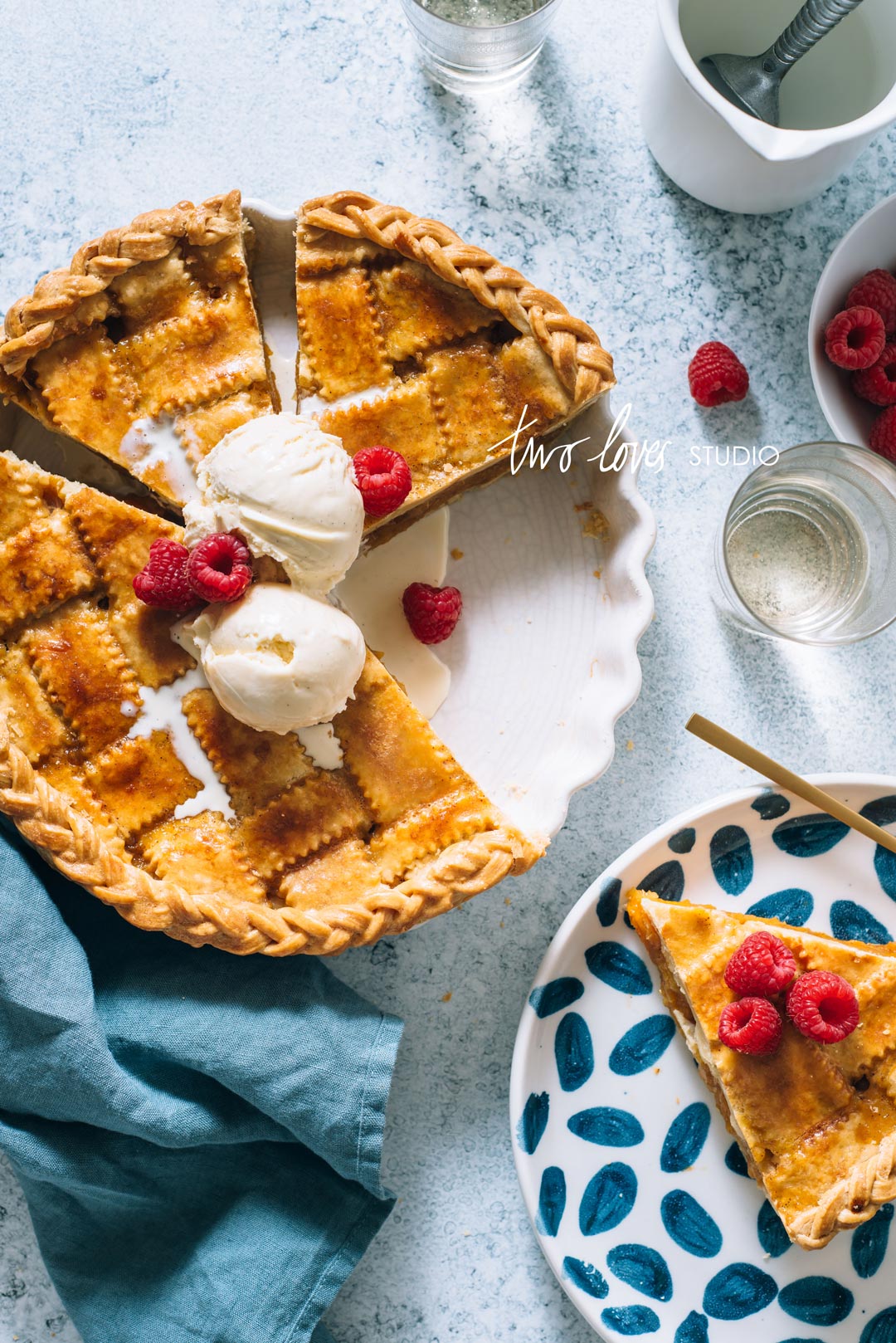
NOW THIS!

Above are the images from the start of my journey as a food photographer till roughly four short years into my craft…As you can see a lot has changed.
Being a self-taught photographer has its advantages, it’s exciting, it’s scary and it is incredibly rewarding.
BUT there is a heck of a lot of trial and error, and without killer tips, knowledgable mentors and personalised feedback it can be a long journey.
From seeing my own work evolve and helping countless others with personalised coaching and image critiques, I’ve seen a lot trends, mistakes and areas for growth in the work of new, amateur/hobbyist and intermediate food photographers.
Food Photography Critique – Killer Tips to Perfect Your Photos
If you have a look at my above comparison images over a 4 year period there are so many stand out things that come to mind that allowed me to improve my food photography game.
Performing a food photography critique on my own work, here are 5 stand out tips I see many creatives can take advantage of (myself included).
Cover Image Zuzanna Ploch
Flat Boring Lighting!
The biggest mistake I see creatives making is getting so caught up in trying to manipulate their light, that they choke it to death. I know, because I used to do this. I would diffuse the sh*t out of my light as that’s what I read EVERYWHERE you should do.
This results in a lack of shadows (which btw are just as important as light itself, they may even be co-dependant).
The first two images are the result of this. Boring, boring boring. If my styling hadn’t improved in the second image this would have wound up as falling flat on it’s face like Image 1 ( Lemon Tart).
TIP #1. Think about mastering your shadows just as much as you manipulating your light.
RELATED: 4 Must Haves For Beautiful Natural Food Photography Lighting

Editing Completes The Story.
Ansel Adams said, “you don’t take a photograph, you make it” and part of ‘making’ a photograph is editing it to be your final vision, adding your final stamp, your style.
Your image is not complete until you’ve edited your image. And I mean really edited it. I see a lot of images not living up to their potential due to the simple fact that they’re either not edited or they haven’t been edited with ‘contrast’ in mind.
Granted my lighting isImage 3 (Apricot Pie) kills the lighting in Image 1 (Lemon Tart), but the BOTH the lighting and the editing have resulted in a contrast between light and dark parts of the image. My use of contrast here is key!
TIP #2. Add contrast to your images in the editing process to help make them ‘POP’.
PHOTOGRAPHY COACHING SERVICES
Want to up your food photography game but not sure where to start? Need a little help translating your photography ideas into life? Sometimes all you need is a nudge in the right direction.
KICK YOUR PHOTOGRAPHY UP TO THE NEXT LEVEL!
The Rogue Fork.
Countless times I used to chuck a fork, spoon or knife into my shot because I didn’t know what else to do or use.
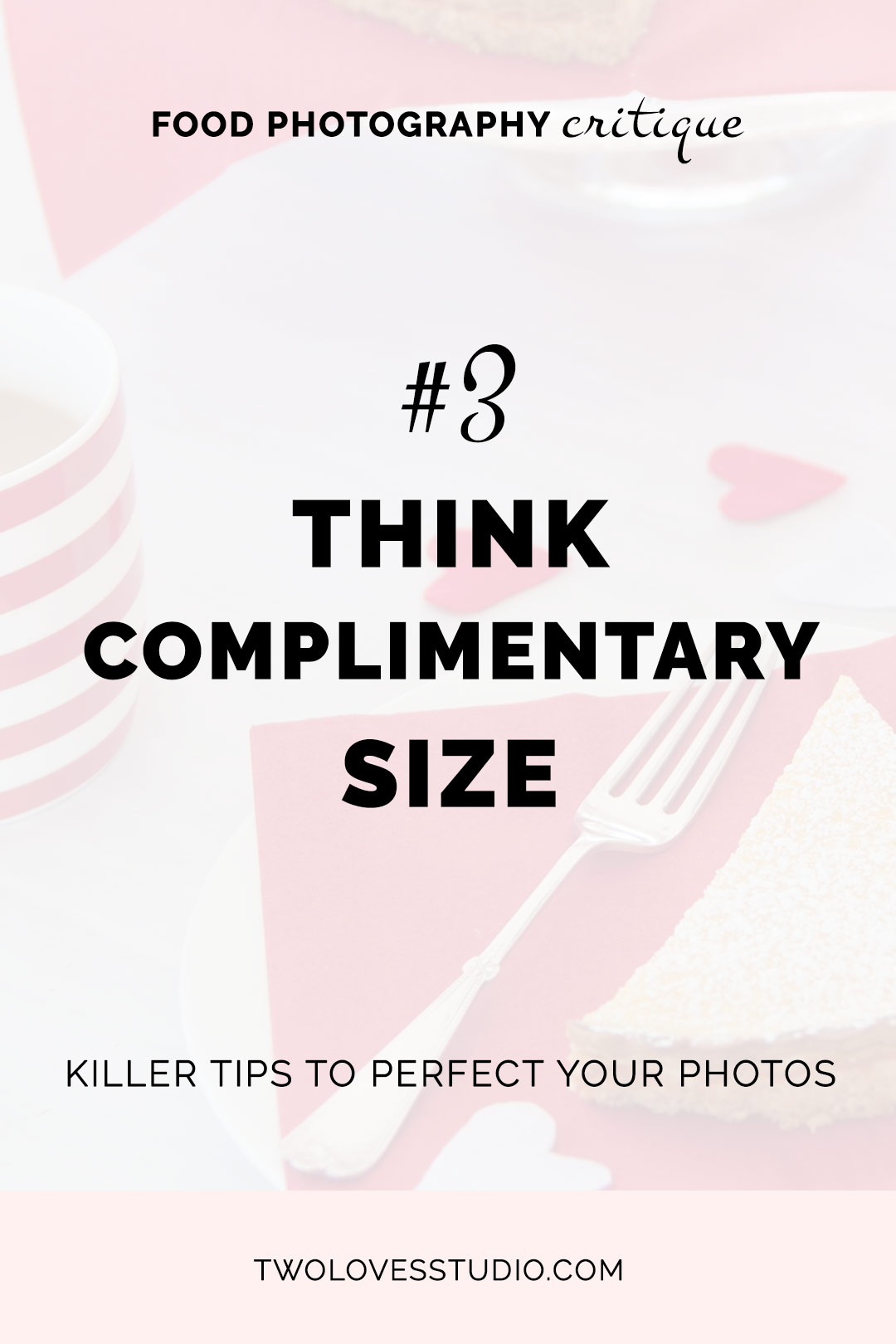
Fork placement should be intentional. It should make sense. I should be complimentary and not compete with your main subject.
DO NOT just whack a fork into your scene (or knife or spoon for that matter) just because it’s food photography. Unintentional placement ends up distracting from your subject.
Exhibit A – Image 1 (Lemon Tart), my rogue fork. It’s way to big for the slice of tart and for the placement I chose. It would’ve been much more powerful to have it poking in from the side of the frame like I graduated to in my later work Image 2 (Key Lime Tart) or Image 3 (Apricot Pie).
TIP #3. Be intentional with fork placement. Choose a fork that is a COMPLIMENTARY size to avoid it completing with your main subject.
Competing Colours.
Less is more. Quality over quantity is something I try to live my life by. But when I started in food photography and starting to see an improvement in my work, I thought that equalled use more, have more.
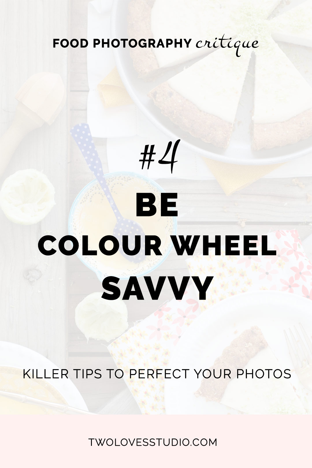
I went from using two (horrid) red napkins in Image 1 (Lemon Tart) to using three COMPETING linens in colour and patterns in Image 2 (Key Lime Tart). Until finally I settled on just one nice blue linen in Image 3 (Apricot Pie).
BUT it’s not the number of linens that is the most bothersome here. It is the competing colours. Just look at Image 2 (Key Lime Tart) #enoughsaid.
TIP #4. Get savvy with the colour wheel and become empowered in how to use knowing complimentary colours.
RELATED: The Most Important Tip For Powerful Food Photography Styling
Find Your Hero Angle.
I was lucky that I managed to pick this up really fast, but it is a simple (and easily fixed) mistake I see a lot of photographers make.
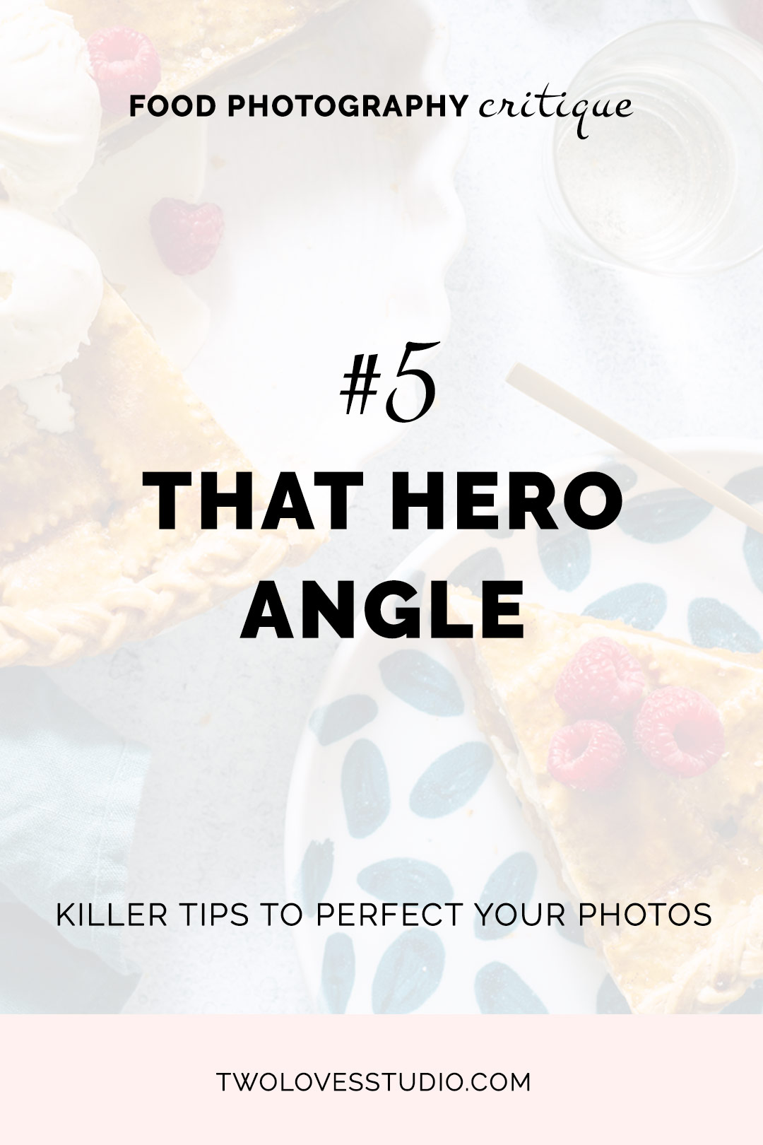
The goal in finding your hero angle is to find the angle that shows your food in it’s best light. NOT the angle that makes it look weird, flat, long or elongated.
Flat dishes like the tarts and pies I shot in this post are best shot from overhead. Just take a look at the evolution from Image 1 (Lemon Tart) to Image 3 (Apricot Pie). A much more flattering angle.
TIP #5. Explore your angles to ensure your food is presented in its best light. If something looks ‘off’, 9 times out of 10 it’s your angle.
I dive deep into this topic in Day 5 of my Free Food Photography Email Course. Take it for FREE. Sign up below.
RELATED: Free 7 Day Food Photography Email Course



Alejandra
Thanks so much for this amazing post Rachel, incredible helpful tips I can apply to my food photography now, no excuse! I love them all! 🙂
Rachel
So pleased to hear that Alejandra! There are some killer tips in there for sure.
Zuzanna
Rachel, thank you very much for all you comments on my photo. I will take them to my heart 🙂 I am glad you like the lightning in the photo. I’ve just thought that there is not enough light and not enough highlights. You are right about that plant that it is distracting. Maybe it was to much of prop styling and not focusing on food 🙂
Rachel
You are most welcome Zuzanna! I think it’s a good lesson to learn exactly ‘what’ is it within the light that isn’t working for you, as there are so many elements in light (as you’d know!).