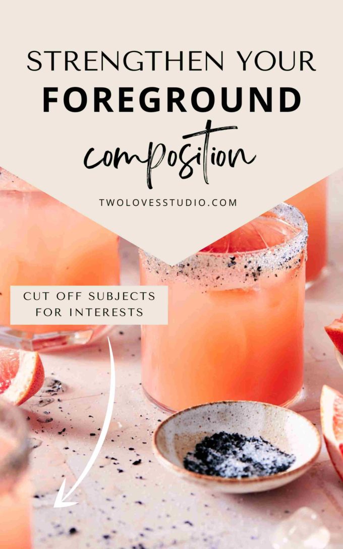
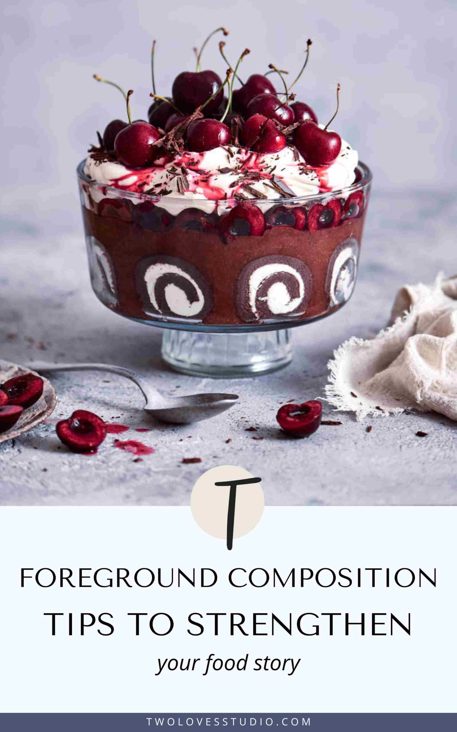
How do you make your food photos interesting? A composition tip is to use the foreground space in your photos to help you not only create a food story, but to strengthen it.
In still life or food photography, we are responsible for placing all of the subjects in our scene. We can get so focused on the food being perfect and adding a lot of props that we can forget that ‘where’ we position them matters.
Let’s explore what we can add to our foreground to strengthen our images
Foreground Composition Tips: What is the Foreground in Our Photos?
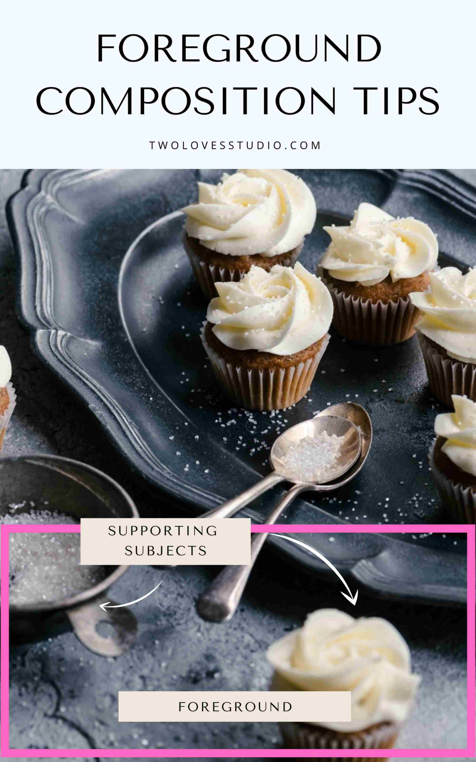
The foreground usually refers to the area in our image which is closest to the camera, or at the bottom of the frame for photos that are taken with a straight-on to 75-degree angle.
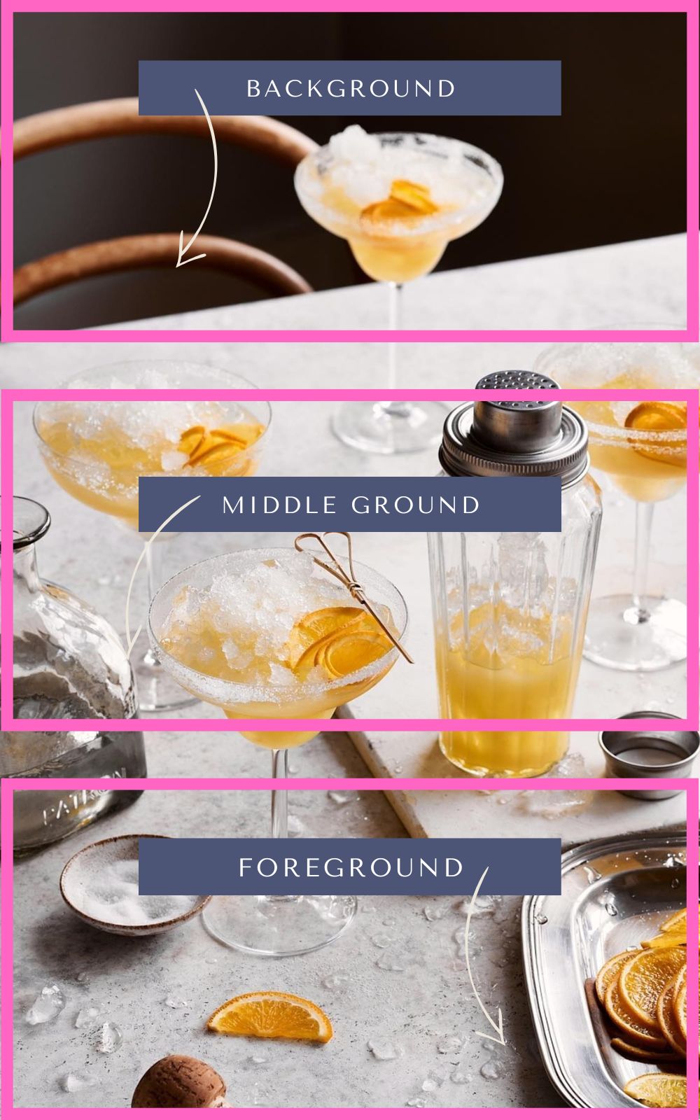
Now that we know where the foreground is located, let’s look at why it’s important to add subjects, tips and what not to do.
Learn more about composition by joining in Composition Essentials Masterclass.
Adding Supporting Elements to the Foreground Adds Depth
The foreground in our food photography helps to provide the viewer with context for our food story and creates an important notion of a sense of scale.
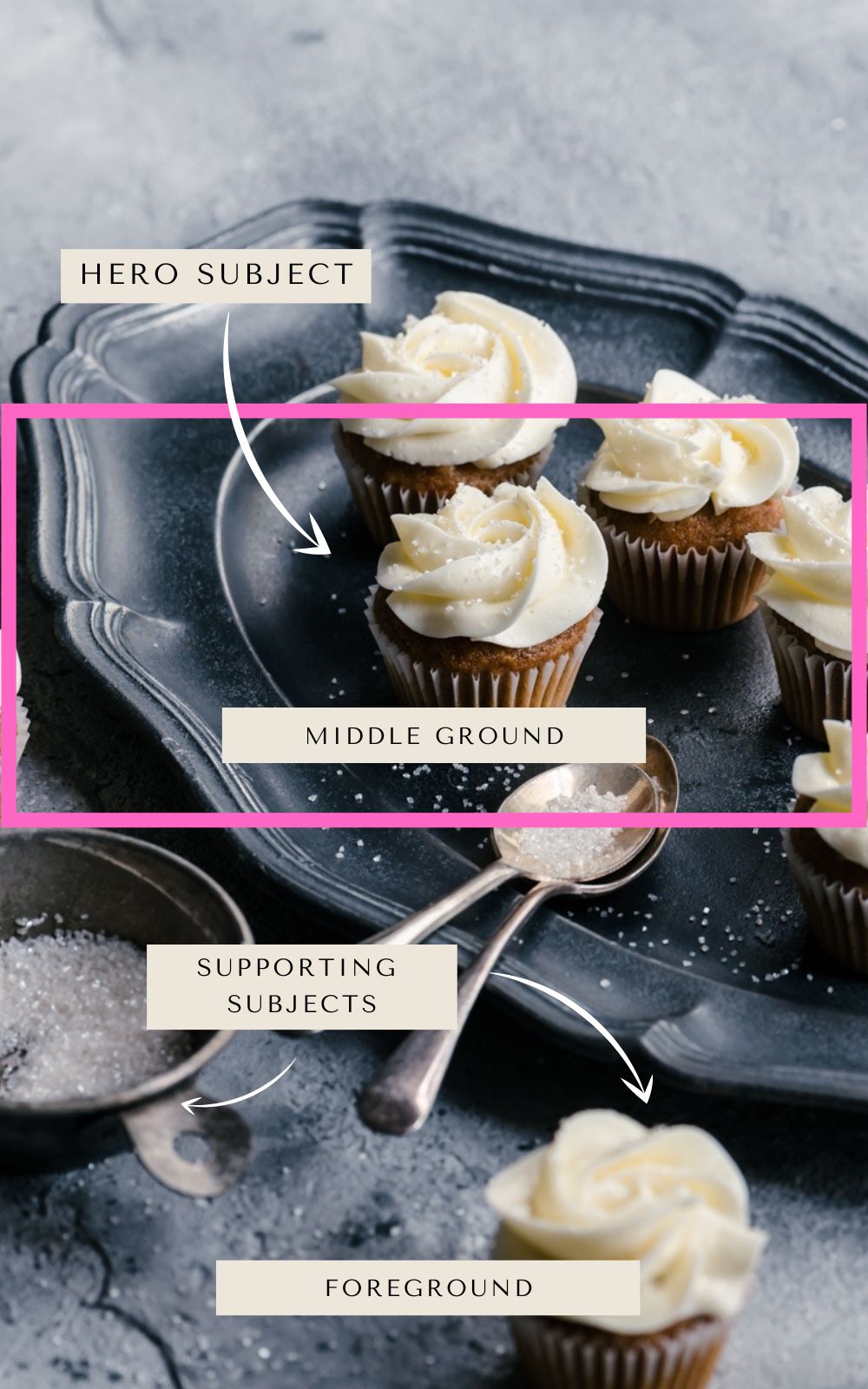
The hero subject isn’t usually placed in the foreground, so we want to make sure that any subjects or supporting elements we add don’t distract our viewers or demand our focus.
What to Position in the Foreground?
In a nutshell, think about subjects or supporting elements that will add to our food story, rather than distract from the main hero subject.
All over, these items should be proportionate to the space and not too large and distracting. This could include:
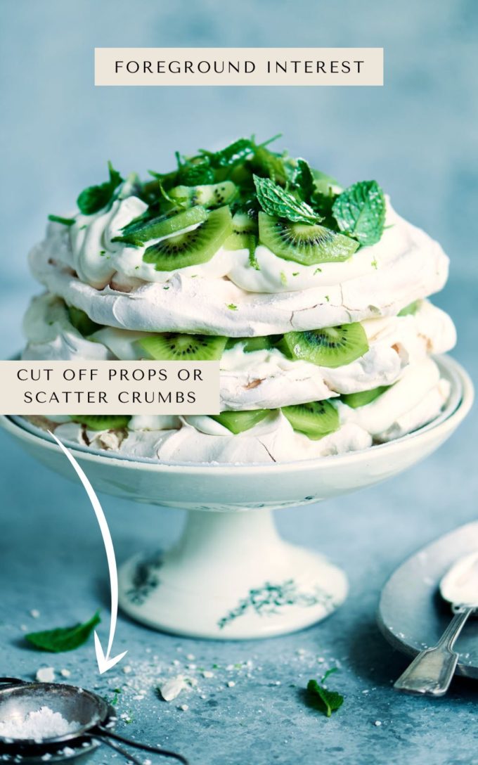
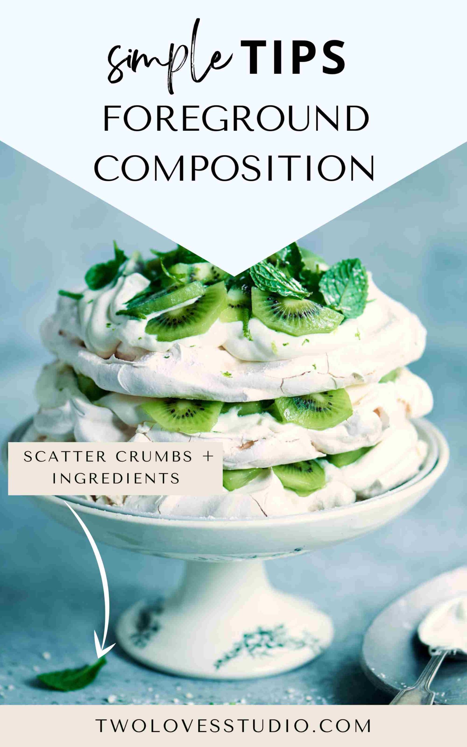
- Crumbs, drips and scattering of small garnishes etc
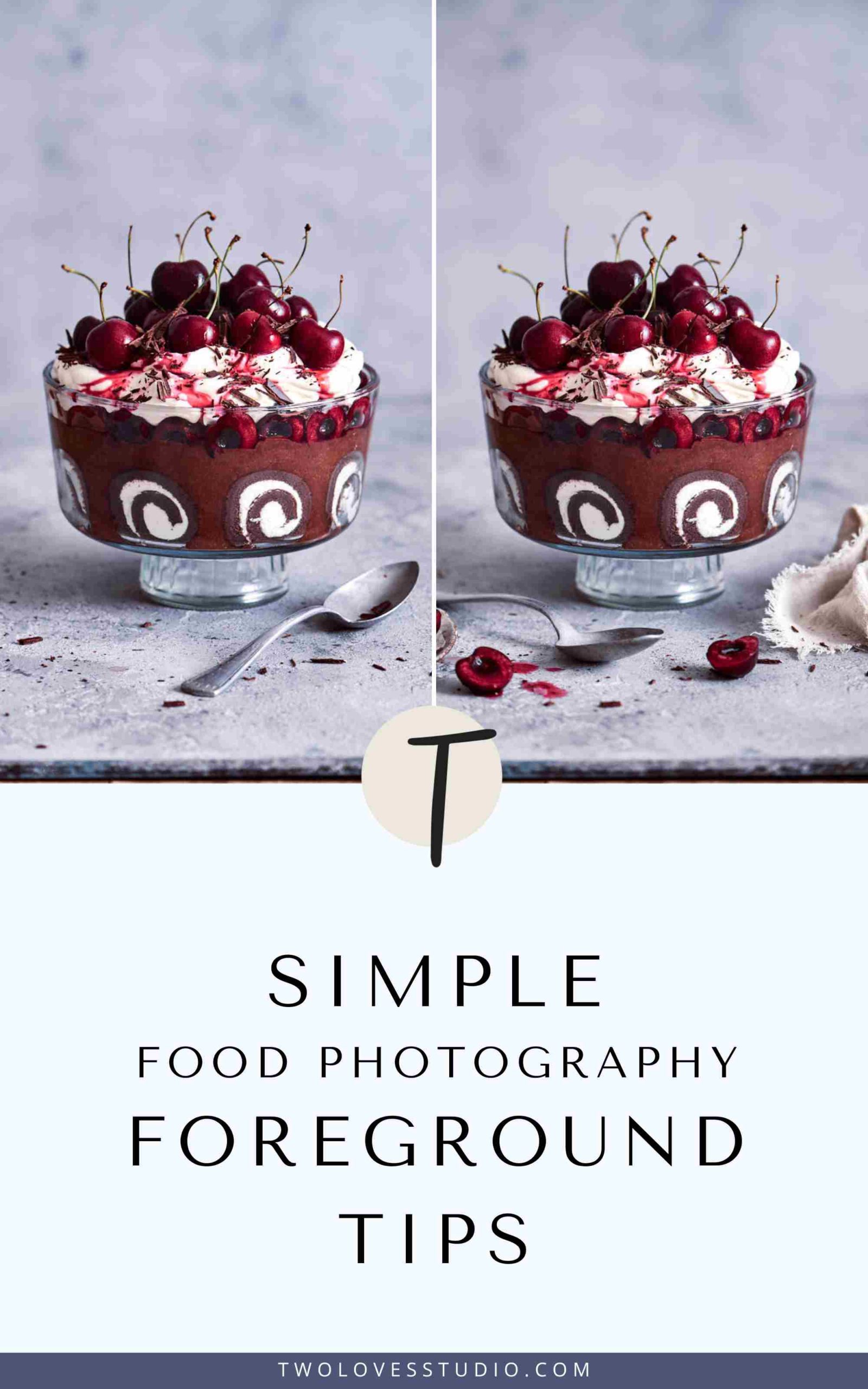
- Peeking in napkin or linen
- Edge of a spoon or fork, or other props
- Cut off (at the edge of the frame) subjects so they don’t appear too large
- Pinch bowl with salt, pepper or ingredient from the recipe
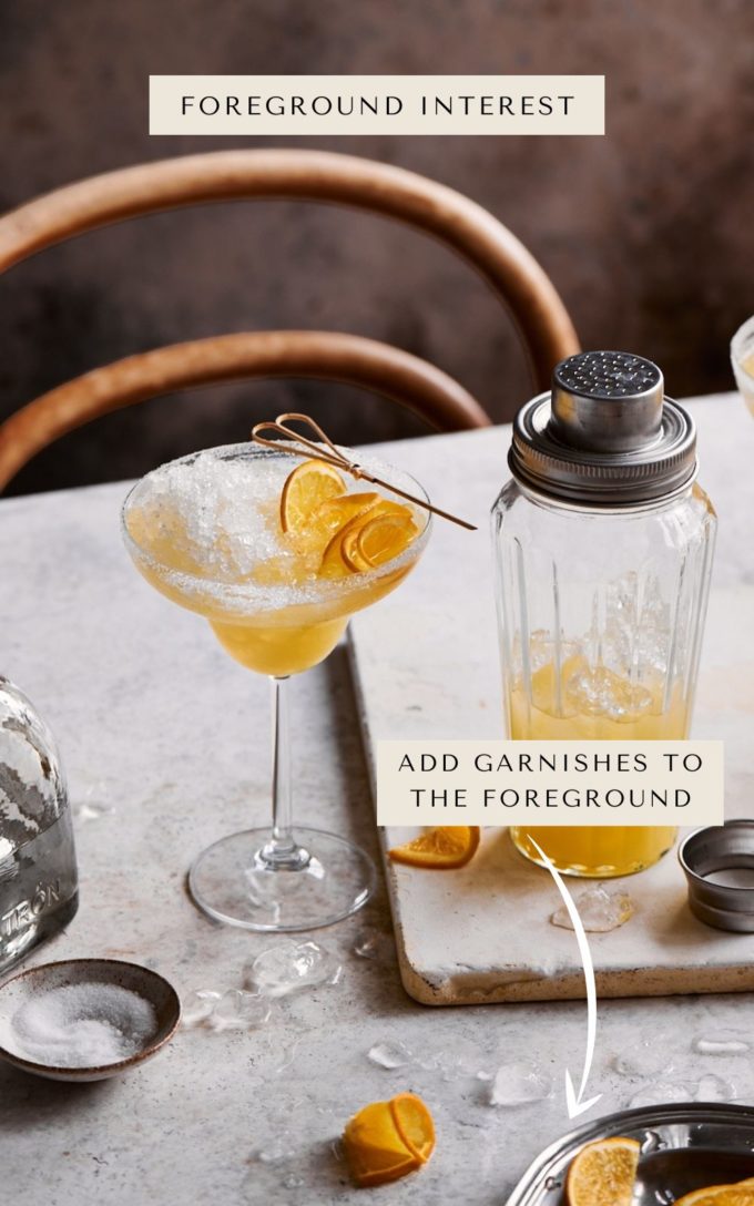
An Example: Let’s Explore How Different Foregrounds Feel
There is no ‘right or wrong’ when it comes to your creativity. I like both of these shots and they have vastly different elements in the foreground.
To me, one shot feels more like a minimalist portrait of food that would be good for a magazine where text would fill the negative space. The other, feels more like a food story that can stand on its own.
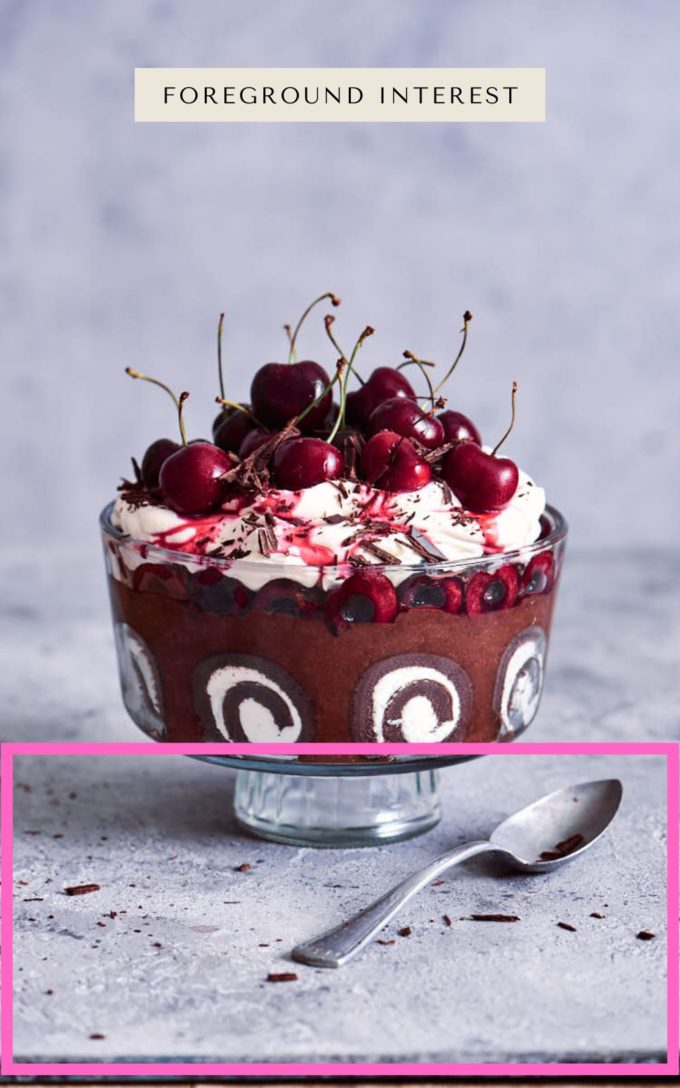
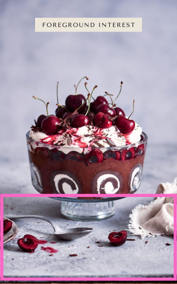
Ask yourself, how do the differences in the foreground allow you to connect with these images? I’d love to know which one you like. Let me know in the comments below.
Do’s and Don’t’s with Foreground Styling in Food Photography
I don’t believe in rules and I always think they are made to be broken. However, if you’re a new food photographer, it’s helpful to know some guidelines for what to style in the foreground of your food photo.
Here are some do’s and don’t’s for styling your foreground:
- DO position subjects at the edges of the foreground
- DON’T place subjects that are really large and distracting
- DO use a shallow depth of field in the foreground to push the viewers to the hero food
- DON’T have more foreground than middle ground for balance
- DO use small items like crumbs, drips and scattered ingredients
- DON’T position too many items so it feels overwhelming
If you’re interested in learning more about composition and styling, check out my in-depth Composition Essentials Masterclass. It contains everything you need to know to style, compose and photograph your unique food stories.
If you liked this post on foreground composition tips, you can also check out other resources and blog posts I have on Composition + Styling.



Felix de Vega Photography
Rachel, honestly this is one of the best food photography blogs on the internet, so much practical information, thank you!
Rachel Korinek
Thank you so much Felix. Glad you could stop by.