I was honoured to be able to co-host a training on color with Capture One and David Grover. We focused on Appetising vs Correct Color in food photography, diving into some of the tools that we can use in Capture One to correct and enhance colour.
Correct color in food photography comes down to how food should look to make it appetising.
Press play to watch!
Food photography is bursting with colour. Our job as photographers is to capture and edit colour to be appetising. In this training, we’ll explore appetising vs ‘correct colour’ as we search for the best edits to enhance colours in food.
From bold to desaturated colours, we’ll uncover how to edit the colour ranges in a number of colour foods. From stewed rhubarb to chocolate cake. Learn which tools to use to edit food photography, as well as different workflows and ways to think about editing colour.
Tips for Editing Correct Color in Food Photography in Capture One
When you edit color in food photography, there are few key things to think about. Our human brains are very astute at figuring out what colors food should be. At a primal level, it helps us to eat the right, safe and ripe food vs the poisonous or food that has been spoiled.
Here are some tips from the training when it comes to colour:
- Bold colours need to be managed separately using different tools.
- Colours in food don’t have to be saturated to be beautiful. Sometimes we need to desaturate colours.
- Colours work together, there is rarely a pure colour when it comes to food.
- We see a lot of ‘analogous’ colours in food, and so we often have to edit colours sitting next to each other on the colour wheel.
- Exposure and contrast affect colours, I work on appetising colours at the end of my workflow
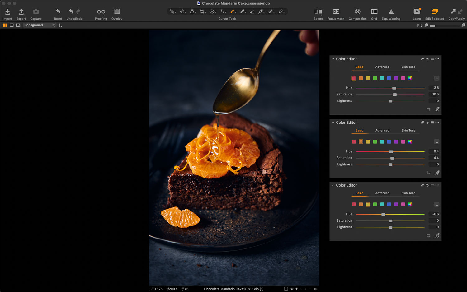
Chocolate is a Color & Needs Mulitple Color Corrections
Most photographers struggle to photograph and edit chocolate because we often think of it as a brown food. While it is, it’s also made up of hues from red to orange, yellow and sometimes even green.
Next time you need to edit chocolate, think about if you can see these colors in your photo and use the Color Editor – Basic Tool to alter (or enhance) the presence of the chocolate color.

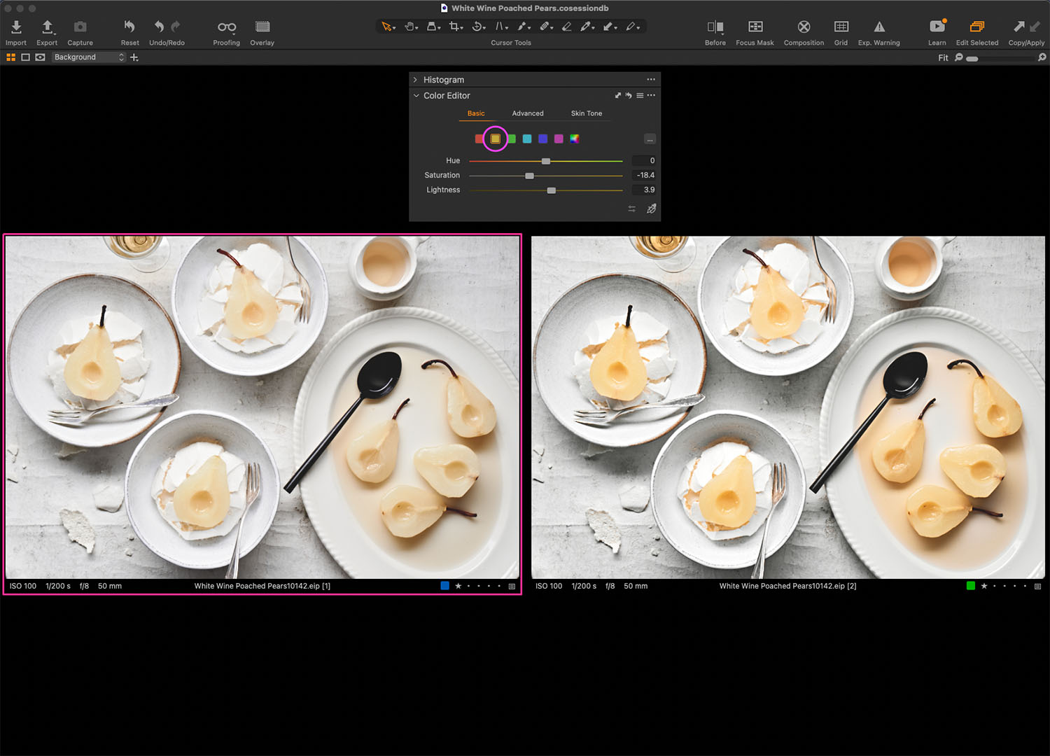
Desaturating Colors Can be Beautiful
A lot of us think about color as being bright and bold. Food is often so colorful that we can forget that we don’t always have to desaturate a color for it to have an impact. I tend to think about color in terms of what draws the eye.
Sometimes too much color or a vast range of colors can feel confusing and overwhelming. Selectively saturating and desaturating is how we show the viewer what’s the most important element in our image or food story.

Just take a look at these White Wine Poached Pear shots. They are both beautiful for different reasons. One is more saturated and one is desatured. Can you notice texture differently in these shots?
Did you enjoy this training? Interested in learning more about Capture One? Join my Capture One Magic Masterclass today.
For more training and tips on Capture One, check out these posts.
18 Top Tips New Capture One Pro Users Need to Know.
Lightroom vs Capture One: Important Differences You Need to Know
Switching From Lightroom to Capture One: When & Who Should


