While it’s not always realistic to use composition grids when you’re shooting, guides like the six I’m about to share with you are super helpful when it comes time to crop your images.
You’ll find all of these in Lightroom, Photoshop, and Capture One—but not every guide will work for every image. As the photographer, it’s your job to figure out what feels most natural, balanced, and interesting to you.
Exploring the visual impact of cropping is an amazing way to improve your image. (And spoiler alert—I have 38 composition cropping guides that you can start using right away!)
This is by no means a comprehensive guide to working with composition grids, but it will give you a good start! Let’s dive in.
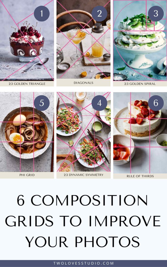
Composition Grid #1: Rule of Thirds
You’ve probably heard of this one before—it’s one of the first composition theories that most people learn. Now it’s time to unlearn it.
The rule of thirds divides the frame into nine equal areas—3 x 3. Then, you place important elements in your photo along one or more of the lines where they intersect.
The five other techniques we’re going to discuss are more powerful for creating tension, balance, movement, and interest. But the rule of thirds is a great introduction to getting out of the habit of framing your subjects in the middle.
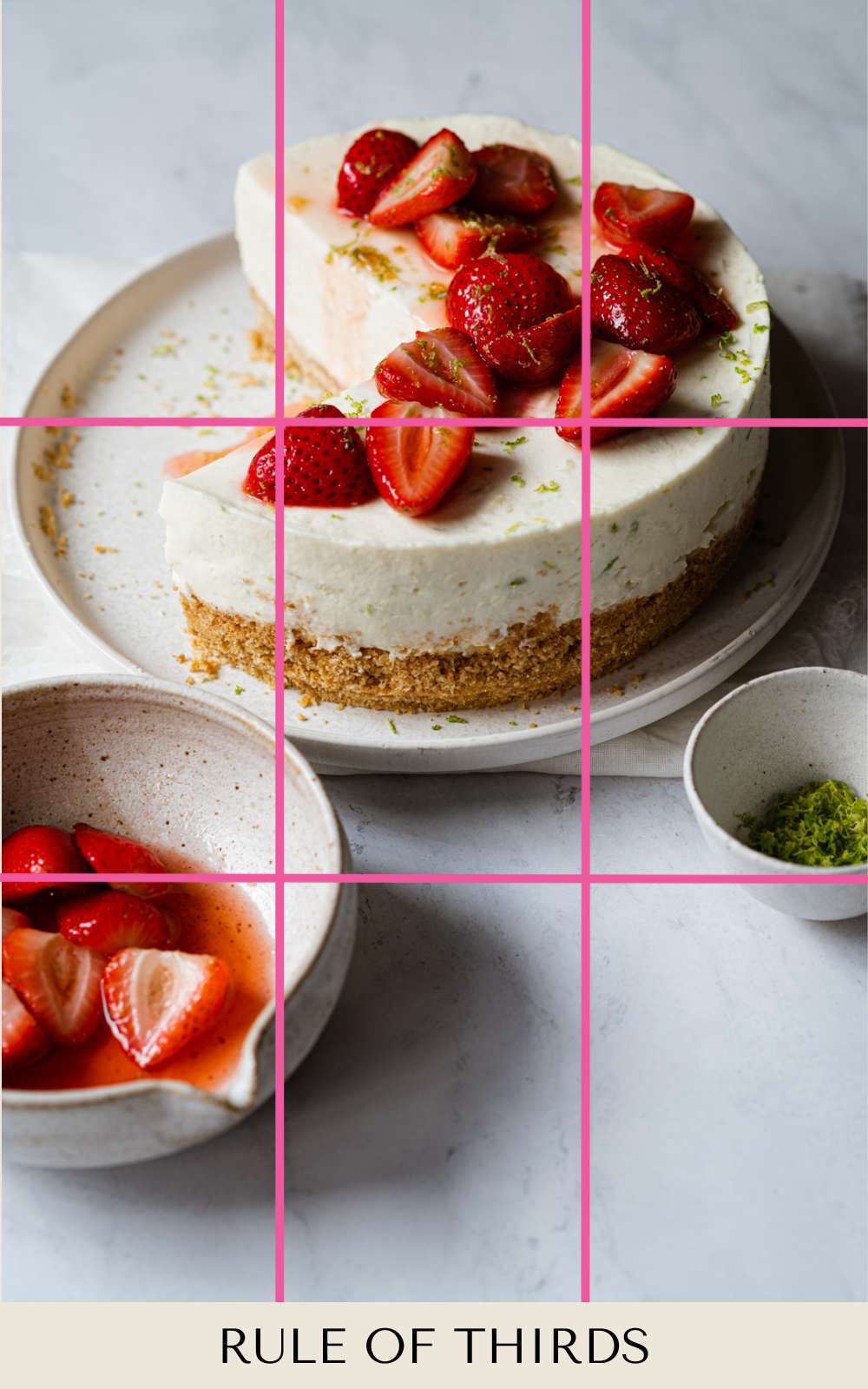
Composition Grid #2: Golden Triangle
The golden triangle is just one of the guides that relies on the Golden Ratio—a naturally occurring ratio of 1:1.618 that is perfectly balanced and aesthetically pleasing.
This guide divides your frame using a diagonal line and two smaller, reciprocal lines from the other corners to meet the main diagonal line. The result? A series of triangles and intersecting lines on which to place the elements of your image.
Composition Grid #3: Diagonal
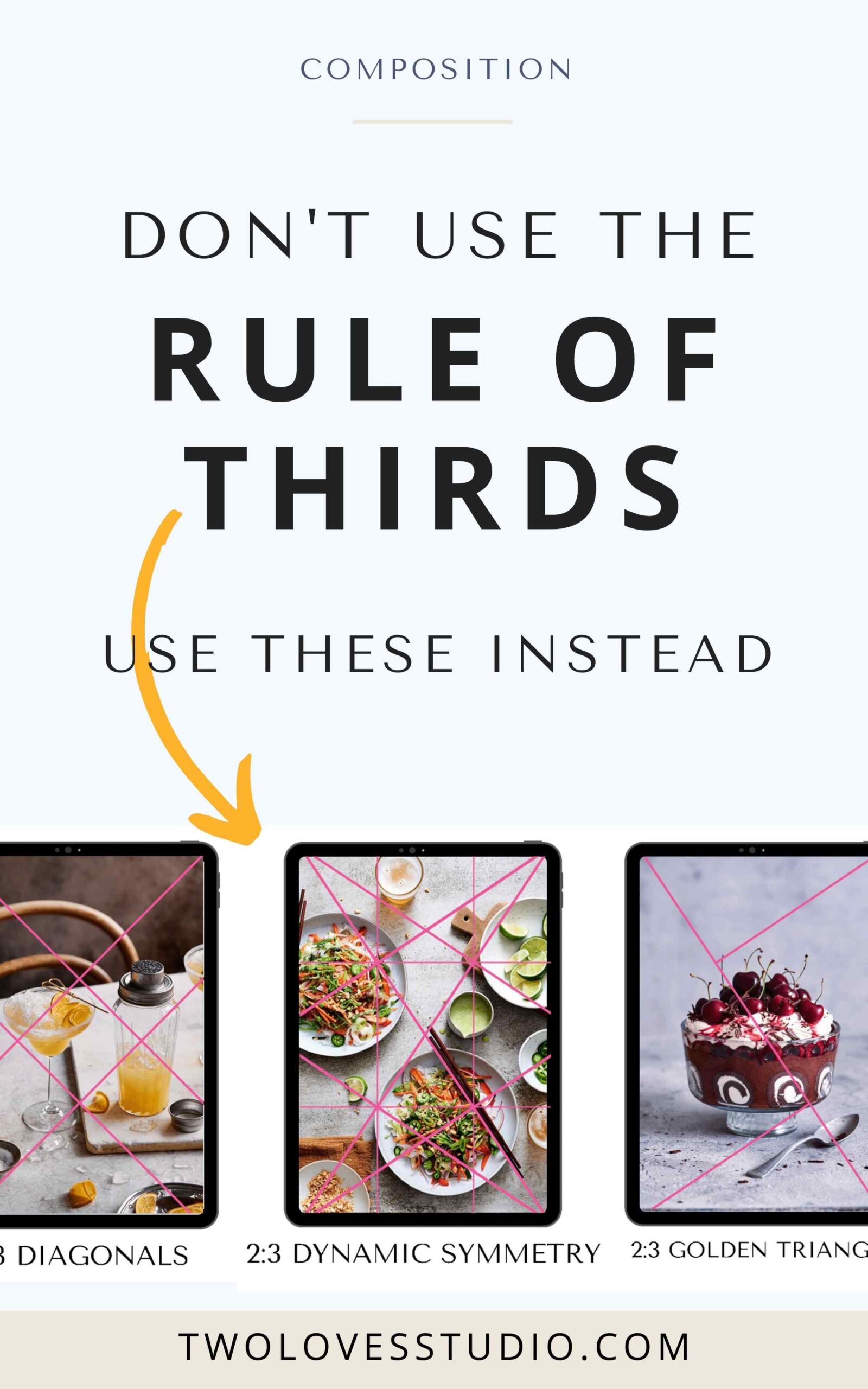
Diagonals help create movement, energy, and emotion in your image.
The diagonal and reciprocal lines are part of the golden triangle we just talked about. Artists tend to intuitively place subjects on these intersecting diagonal lines to strengthen the image and reinforce tension.

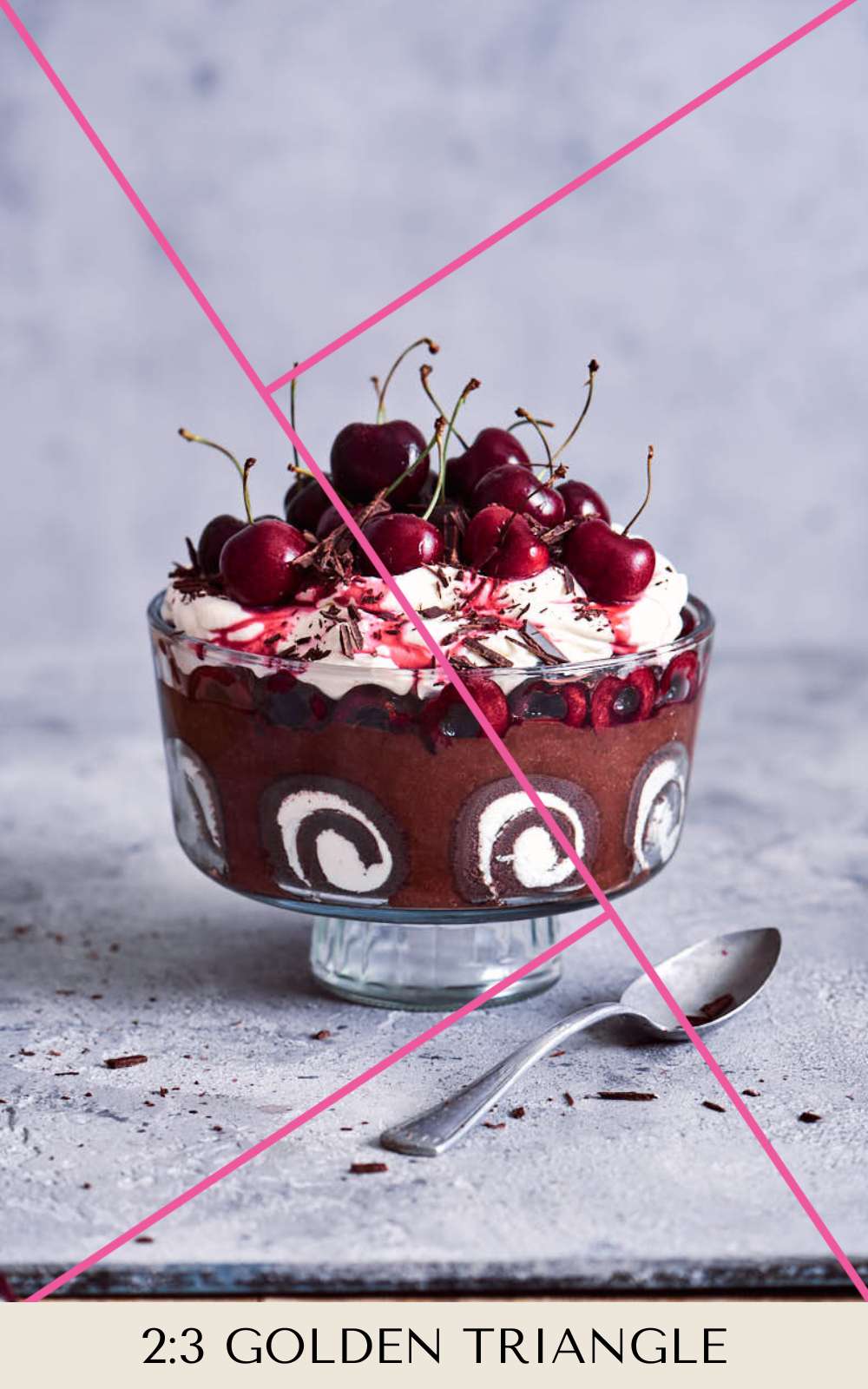
Composition Grid #4: Phi Grid
The phi grid divides the golden ratio frame into 1 : 1.618 : 1 portions horizontally and vertically. You’ll place your main subjects along the intersecting lines.
While the rule of thirds can seem too obvious and sometimes create imbalance, the phi grid looks more natural, balanced, and visually pleasing.
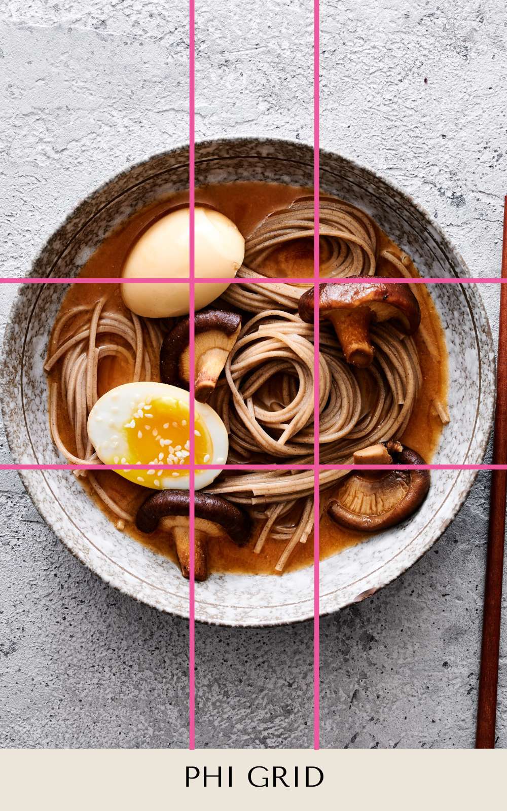
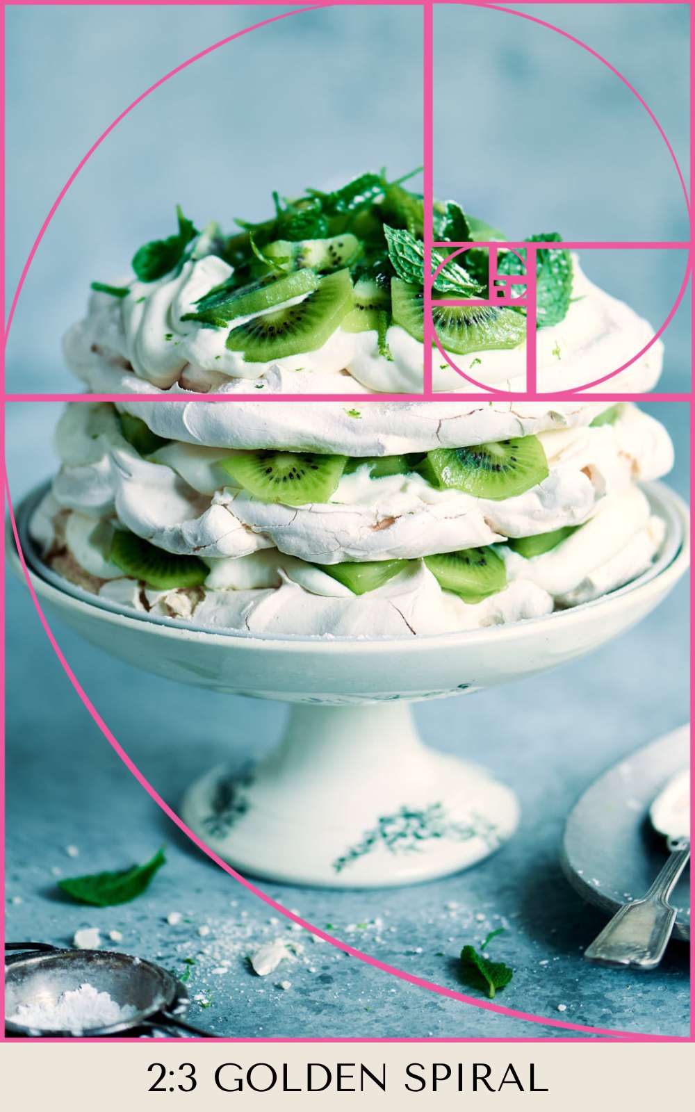
Composition Grid #5: Fibonacci Spiral
The Fibonacci spiral is based on a complicated series of squares, which help position elements. The spiral then gives you an idea of how the scene in the image should flow—through curved leading lines to a focal point.
Also known as the golden spiral, this tool is perfect when you’re dealing with curved lines or compositional movement.
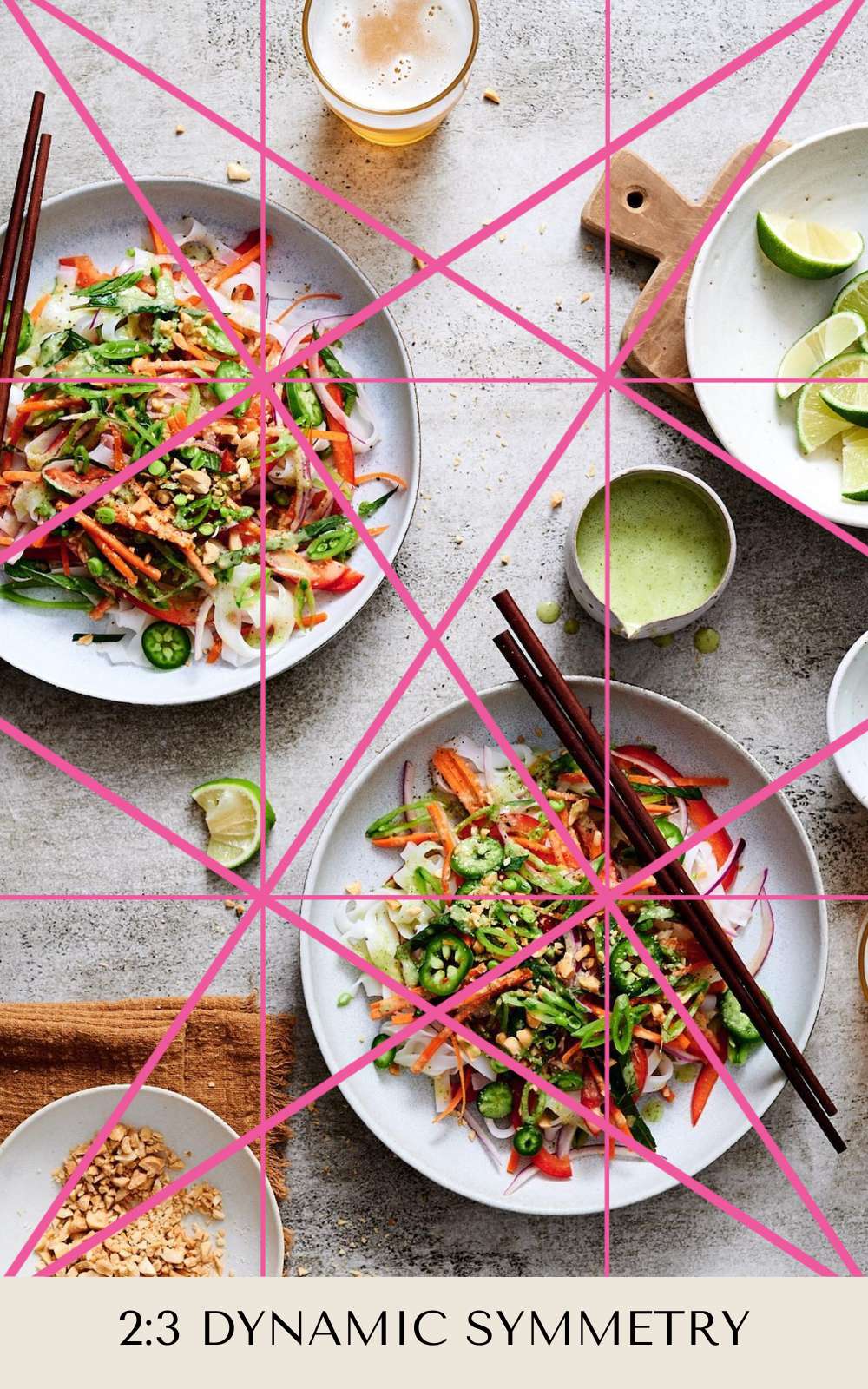
Composition Grid #6: Dynamic Symmetry
Dynamic symmetry is a compositional grid system that uses vertical, horizontal, and diagonal lines to create rhythm, unity, and movement in your images—to make them aesthetically pleasing.
You can use it as a cropping tool or placement tool when creating and composing still-life images. You can also use it while tethering and adjusting your subjects in real-time.
Want to do a deep dive to master this concept and learn tips that will help composition come easier to you? Sign up for Composition Essentials and you’ll get:
- 7 modules of video tutorials focusing on composition
- 5 in-action styling photoshoots (from setup to final capture)
- Instructional food styling videos
- 5 creative photo assignments
- On-demand access
You’ll be on your way to finding your trademark style—and learning how to evolve it!
If you enjoyed this post on 6 Composition Grids, make sure you also check out:


Klaus Krebs
Your wonderful photos show in a simple way the result of your complex arrangements. Both together are really inspiring.
Rachel Korinek
Thank you so much!
Manish Rajput
your content are really very usefull
Rachel Korinek
Thanks for stopping by!
heardle
Thank you, now I know more about composition in photography to take great photos
ivy michael
Exploring composition grids beyond the rule of thirds has transformed my approach to photography. I find that grids like the multiple exposure blending golden ratio and dynamic symmetry offer more nuanced ways to balance elements and guide the viewer’s eye. These alternatives provide fresh perspectives and can enhance the impact of my visual storytelling.
sandboxels game
Thank you for sharing.
Flvto Official
This post was a refreshing take on composition! I’ve always relied on the rule of thirds, but your suggestions for alternative grids have opened my eyes to new creative possibilities. I’m especially intrigued by the diagonal grid—can’t wait to try it out in my next shoot! Thanks for sharing these insights!
Jim Henderson
The combination of video tutorials, in-action photoshoots, and food styling videos is such a temple run comprehensive approach.
emma
Composition grids are an excellent way to create visually appealing and balanced photos. Learning about techniques like the rule of thirds or the golden ratio can make a big difference in how your shots turn out. I’ve also started using a free Lightroom alternative for editing, which has been a great way to enhance my images without extra expenses. Combining strong composition with effective editing tools is a game-changer for anyone looking to improve their photography. It’s definitely worth trying both to take your skills to the next level.
Alexa Hauck
Thank you. Papa’s freezeria