Instagram is always changing and that’s the beautiful (and scary) thing about social media. There are now over 800 million users on the platform, 500 million of which are active daily users!
That’s insane.
But one thing remains constant, sharing your best work will always be the number one game plan. There are so many layers to Instagram and reasons to be on the platform.
In this post I’ll cover:
- You can create a consistent color palette with food photography.
- A consistent color palette doesn’t mean you can’t explore.
- Tips for creating an Instagram color palette.
At the end of the day, what matters the most (for me) is getting enjoyment out of the platform, make instafriends and feel proud of the work I create when you view my overall feed…
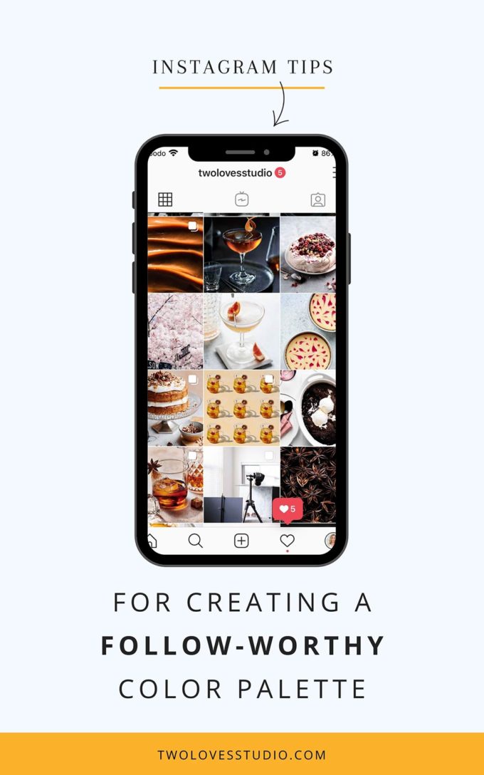
Is Food Photography Harder To Create a Follow-Worthy Instagram Color Palette?
I guess I wouldn’t use the word harder in the context that somehow food photographers don’t know what they are doing, it’s more that food photography trends are broader in terms of what colours we use to shoot with.
We really aren’t limited, bold colours are encouraged and we compliment the food we’re shooting, which by the way is every colour in the rainbow!
Yes, even brown foods…
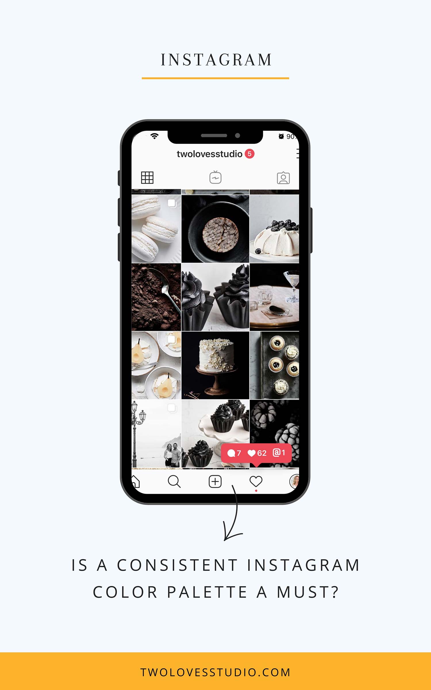
Is a Consistent Instagram Color Palette a Must?
The answer is yes and no! Social media isn’t static. It’s changing all the time.
A couple of years ago, a cohesive color palette did a lot for follower growth. Today, it’s more about individual posts. Yet, you do want to have some consistency so that new followers can instantly know what you do.
In my opinion, gone are the days when breaking from your chosen color palette is a big deal.
What I like to do is *mini-color* palettes that are seasonal or project based.
Rachel Korinek
Meaning, I go through ‘sections’ of my Instagram where I have a cohesive color palette that ties in with a theme I am focusing on.
Get savvy on how to use Color Theory in food photography.
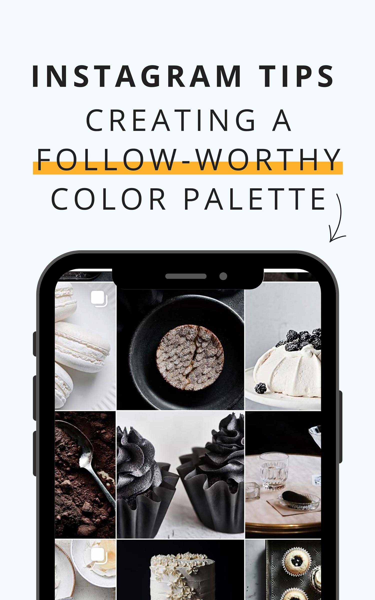
Tips For Food Photographers For Creating a Follow-Worthy Instagram Color Palette
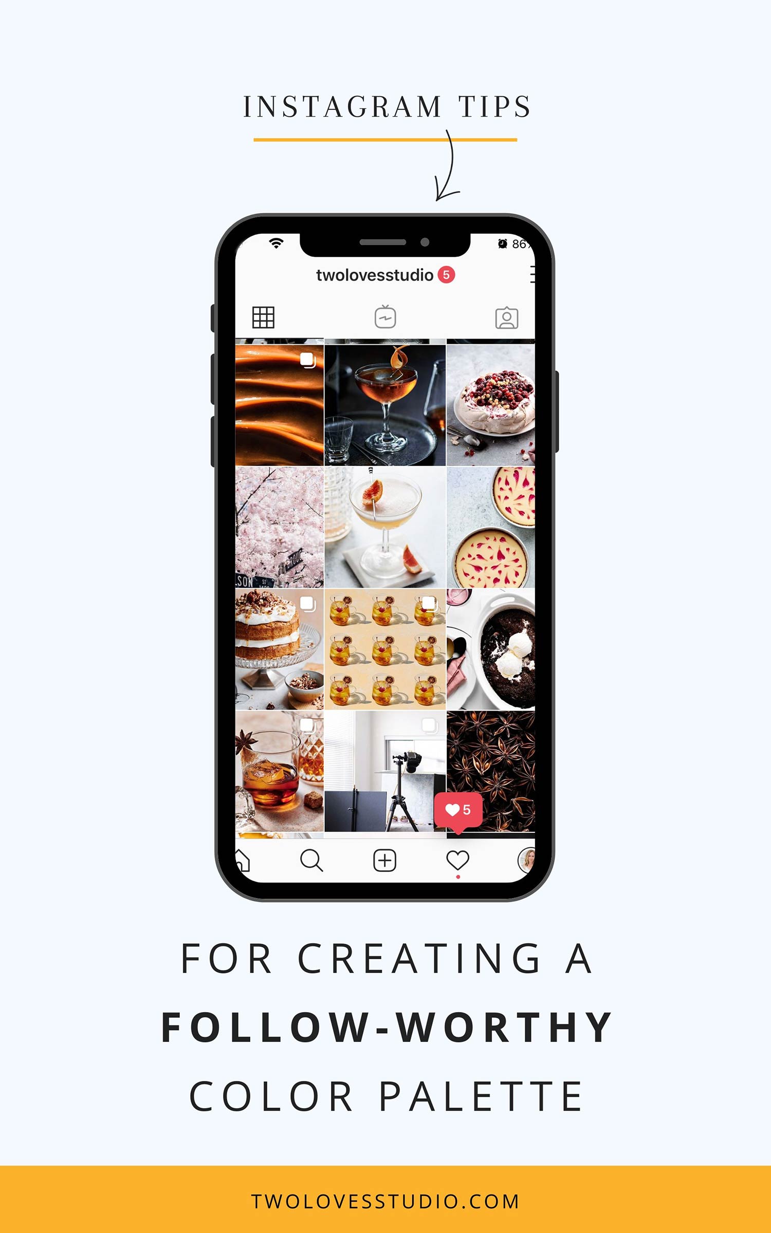
So if you’re a foodie and you shoot everything, love to jump into all sorts of colours when it comes to the food you shoot, props you play with and backgrounds, then here are a few tips for creating a gorgeous Instagram Color Palette.
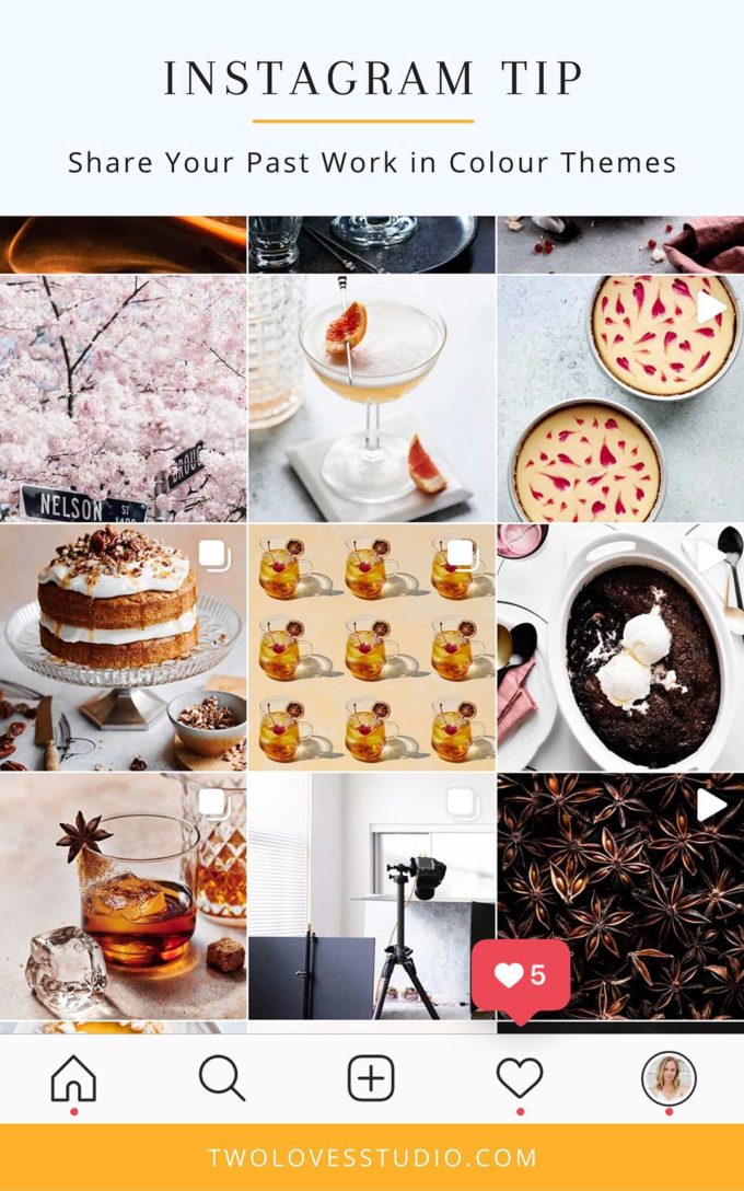
Share Your Past Work in Color Themes
The biggest hesitation when it comes to choosing and sticking to an Instagram color palette is the idea that you HAVE to stick to it forever!
I know that scary word when it comes to creativity. Our style and passions do change after all.
If that’s you, then why not try to share your images in ‘color themes’? You can check out how I integrate colour into my Instagram here.
This is a great tip for sharing your past work.
In the blink of an eye, we’ve scrolled past an image and if the algorithm isn’t on your side then chances are a lot of your followers missed it.
Collating your past work by colour of the food and props can give you a few weeks of a colour theme that can also tie into the season you’re in.
Here are some examples of color palettes I’ve used seasonally, to share a project or create a theme.
That also how I build my portfolio of food photography.
Mix Light With Dark Moods Evenly
Now, I am a sucker when it comes to black and white images, and I know that they don’t integrate as well into food photography as they do with other photographic niches.
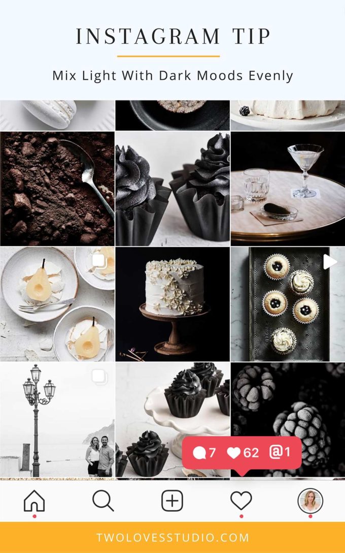
But some of my favourite accounts use a mix of colour and black and white images in every other image kinda way.
So how do we create this when it comes to food photography?
Well, the next best thing is to share a light image, then a dark and moody image. Or, you can drop in a dark shot every couple of days.
When I moved from a light Instagram account to adding more dark or moody shots, I started #DarkFoodWednesdays. The idea was to post a moodier photo every Wednesday to get me in the habit.
Use The Same Set of Presets
To get a consistent feel, try to use the same set of Lightroom presets to achieve a consistent look.
As light is always different and colours render differently in our images, it is handy to have a set of presets that achieve a similar look and feel amongst our feed.
Both of these images were shot in different types of lighting for different emotions.
Different editing or styles of presets would be used to create the same lock with the final image.
If you find that you can’t keep a consistent look with presets, click here to learn more about 3 Lightroom Adjustments to Avoid.
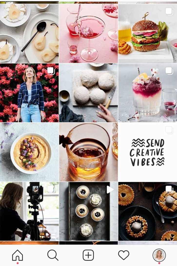
Add Negative Space With Quotes
This one will totally depend on your strategy when it comes to your account and what Instagram color palette you will go with.
But sometimes when we share a lot of food that is different colours, it can feel overwhelming when you land on the feed.
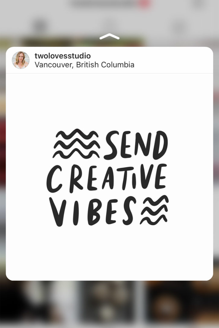
This is sometimes how I feel about my account, so my trick is to share a quote every now and then to act as negative space.
If you use Canva, you can totally whip up a few inspirational quotes and choose a background colour that matches the colours of the images it will surround.
Can you just share someone else’s quote? Well, this is a bit of a grey area.
Technically you’re violating Instagram’s T+C’s by sharing the work of others, but most people are happy for you to share with due credit.
So if you know who the REAL creative is can tag them in the photo and caption, then you’re most likely ok. If not, create your own using Photoshop or Canva.
Use An App To Preview Your Palette
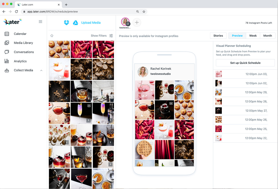
My favourite tool to use with my Instagram and figure out my Instagram color palette is to use Later, and preview my images before they are posted.
They have a cool feature where you can preview the layout of your images before you post and switch them in preview format so that all of your images mesh well together.
Use on both desktop and computer so it will compliment your workflow.
They totally have a free plan too. It is a total time saver and helps us get savvier with sharing a consistent Instagram color palette.
Check Your Instagram Color Palette Online
Not sure what colours you post the most of in your feed?
Then check out ColorKuler to see your Instagram color palette and get some insights into the colours you’re posting.
Apparently, I am Light Pink!
Best practice is to check back often or anytime you are going to batch or schedule your posts as the colours may change.

Most Commonly Used Color
Using ColorKuler, I checked out some of the most loved Insta foodie accounts to see what colours were popping up in their feeds.
Surprisingly a lot of grey tones were consistent and colors with cool blue tones and loads of variations of white (no surprise there!).
What’s your Instagram color palette? What accounts color palettes are you inspired by?
Leave me a link below – I would love to know what inspires you.


Adrienne
Great article. Offered a lot of insight!
Rachel
Thanks, Adrienne!
Liz
Hi Rachel, I always come up in brown variations Color Kuler, must be a tie in to my down to earth nature 🙂
Rachel
That’s so interesting Liz! Just looking at your blog name, I can see that it would tie into that fact. Cool huh?
Mette
@myfoodpassion
I think I am all over the place! Just upgraded my old old camera and trying to learn. Any suggestions on my instagram feed?
Rachel
I think we all go through that phase! I think it really depends on what is achievable for you. Being able to use the same background or a few that within the same tones would help with consistency. You’ve got a lot of white and natural wood tones, so perhaps try to stick to those two backgrounds and palettes for your next 9 posts and see if that creates anything for you 🙂
Rachel
Oh and definitely try out Later.com’s preview ap to see your colour palette in action before you post 🙂
Silvina
Love this article… I’m working on finding my edition style… I usually use B&W for personal photos in my IG account. I’m totally inspired by Dana Walton (danawalton) and Dolores Mendilaharzu (dolores_mendilaharzu) and , of course you!
My IG is sil_fotos
Rachel
Hey Silvina! Thanks so much 🙂 I like the combination that you use! It is very unique. Love the subtle pops of colour throughout. Do you feel like this is working for you?
Amparo
Hey Rachel! I’m curious, which are some of your favourite accounts that use a mix of colour and black and white (like you mentioned on this post)? Thanks!
Rachel
Hey Ampro, thing is that their feeds will have already changed and could be different right? Local Milk and Linda Lomelino are ones that I think would still in that colour palette 🙂
Kitabread
Thanks for sharing
Rachel
You’re so welcome!
Dance Plus
Nice one. Thanks for sharing.
Rachel
Thanks for stopping by! Glad you enjoyed the article.
Michelle
Hello Rachel,
This post was so insightful & I really appreciated how many tips & pointer it included! I’m looking at changing up my instagram up & this article has helped give me an idea of what I can do to reach my end goal!
Thank you so much!
Rachel
That’s super cool Michelle! Come and say hi on IG. I’d love to see what you end up doing. @twolovesstudio.
jhansi ki rani
Great Information sharing .. I am very happy to read this article .. thanks for giving us go through info. Fantastic nice. I appreciate this post.
Rachel
Thanks for stopping by!
Pariwiki
Nice one. Amazing to watch such a simple food item with the great photoshoot.
Katia Cooper
I am following you on Instagram. Great stuff! Also trying to follow your steps for growing my business.
Thilini Mendis
Thank You Rachel.
I’m following these tips to get my Instagram rocking.
I had an Insta page with 24K followers and I lost it as someone hacked into my email and took over my Insta.
But anyway, I’m trying to build it up from scratch and your tips are really helpful.
Keep sharing!
Rachel Korinek
I am so sorry to hear you lost your IG, that’s terrible someone hacked it. I wish you all the best with the new account and thanks for stopping by.
Hasibur Joy
I’m following these tips. I hope it will help me to get more engagement on instagram. Anyway, Great stuff!. Thanks for sharing this.
Rachel Korinek
You’re so welcome! Thanks for stopping by 🙂
ytmp3
Great tips! I love how you emphasized the importance of consistency in creating a color palette. Can’t wait to try out the tools you recommended!
Spotify premium apk
Great tips! I love how you emphasized the importance of consistency in color palettes. I’m excited to try integrating more harmonious colors into my feed – it really can make such a visual impact!
Ri188
Great tips! I love how you emphasized the importance of consistency in color palettes. It really makes a difference in creating a cohesive feed. Can’t wait to experiment with my own palette using your suggestions!
Pkr 888
Great tips! I loved the idea of using a color wheel to find complementary colors. Can’t wait to try out some of these suggestions for my own Instagram feed!