Let’s talk about the basics of color theory in food photography.
When you’re starting out, color theory for some people can feel overwhelming. It’s actually a really simple technique, but sometimes simple isn’t always easy to do.
Color theory is a wonderful composition technique, especially with food when colour is so crucial to our food stories. You can also learn about Advanced Color Theory and my best Color Technique Tips in these posts.
In this post, I am going to share some basic color theories and an example of how I use them in my work, which will hopefully inspire your next photo shoot.
Basics Color Theory Techniques
When it comes to color theory, the goal is to create harmony, balance and interest in our work.
Interested in advanced color techniques? Check out my Advanced Color Theory post.
The Fundamentals of Color Theory: A Color Wheel
We use a color wheel with unique combination pairings, to understand what colors we want to bring into our photos.
Now color theory can go a lot deeper than this, depending on the colors and the pairings that we use, it can evoke different emotions. It can create different movements, and it can really act as a different language to tell us something about our food.
So the first and most basic is we have three core theories that formulate color theory regarding food photography.
Color Theory: Analogous Colors
This is very simple to use and very beautiful. The analogous color theory works on the idea that we use colors that are next to each other on the color wheel. So we want to use two or more colors so we could use green or blue, which are next to each other. Or we could go for something like red, orange, and yellow.
One really cool thing that I think about analogous colors is we often see it in nature when it comes to food. Just think about beautiful heirloom tomatoes. We have reds, oranges and yellows all available in the one food. So it’s a really simple and powerful way that we can create a food story.
Here are some examples of how I’ve used analogous colors in my work.
Green and Blue Colors
The fashion world would tell you not to put green and blue together, but in food photography, these colors actually work really well together. Let’s take a look at this Kiwi fruit and mint Pavlova photo.
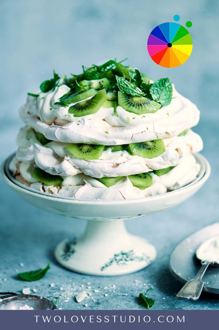
I have paired the key ingredients, which are green, with a blue background. This colour combination helps to give this beautiful, crisp and refreshing feel.
Red Orange and Yellow Colors
Another combination of analogous colors that work well together is this beautiful stewed rhubarb shot. The gorgeous pinks and reds all the way through to oranges and yellows are all in one shot, which is incredible to me.
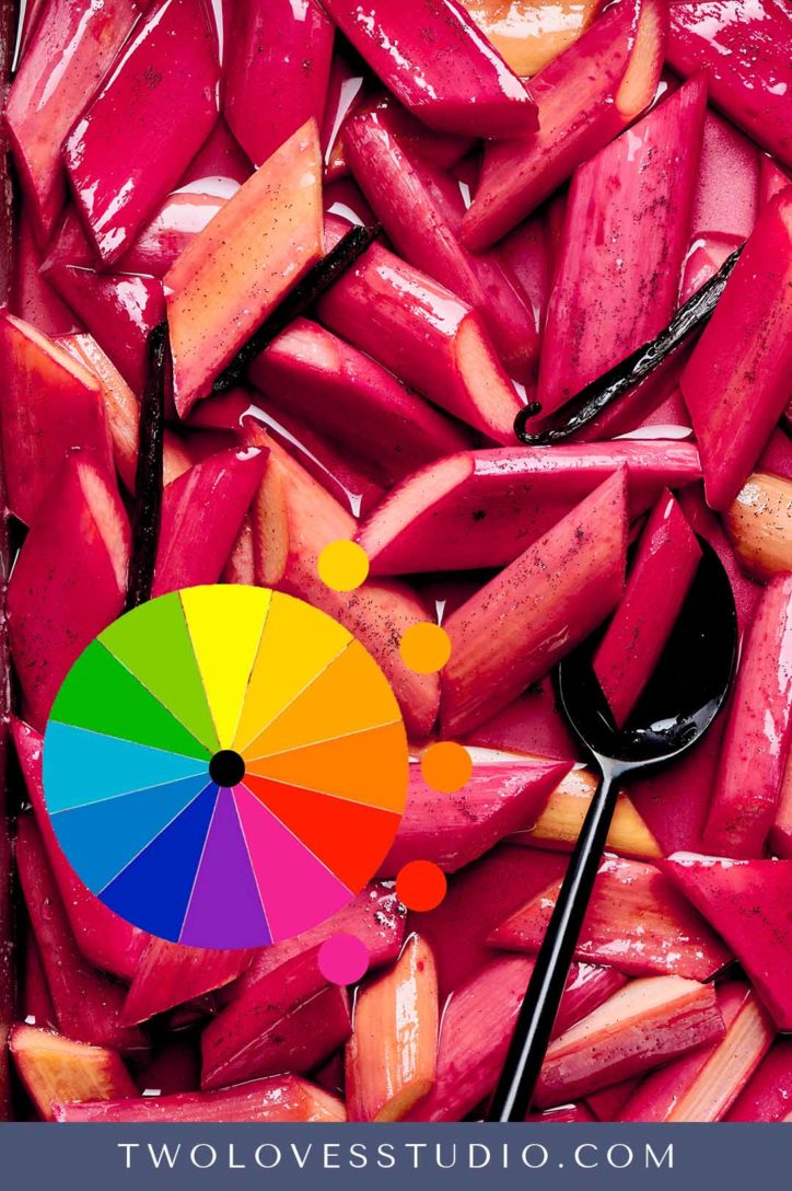
It’s a good idea to think about what feeling your images and these color combinations play together. So when we’re eating rhubarb, it’s in spring. And how does this photo make you feel?
These colors are vibrant and invigorating, and it really matches how we’re feeling in that particular season.
Color Theory: Complimentary Colors
If you were to split the color wheel up into two, we have warm and cool colors. So the way complementary colors work is we are pairing two or more colors on the opposite side of the color wheel.
When using complementary colors, we’re pairing a cool and a warm color together to help create color contrast.
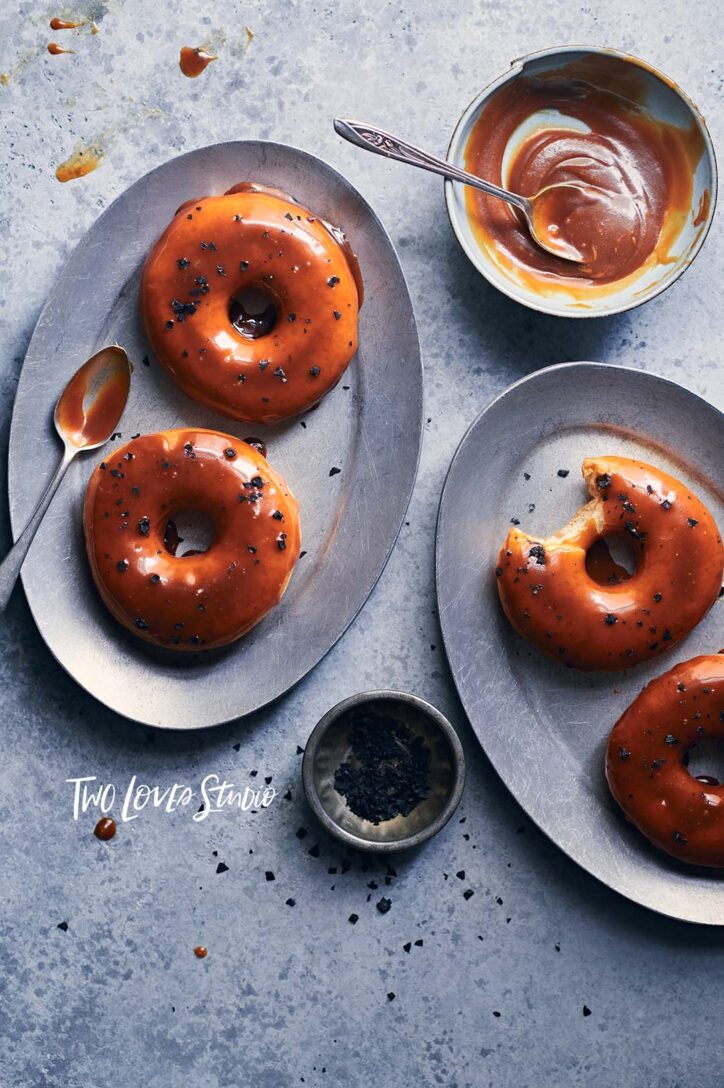
It’s a straightforward composition theory to get started with. And often in food photography, we are using baked goods, which are tones of orange or yellow.
These salted caramel donuts, are very orange. And I’ve paired the donuts with a grey or blue background. Orange would be paired with what’s directly opposite it on the color wheel, which is blue
Then I’ve gone and changed the white balance in editing to give this really cool feeling. The cool feeling of the background is allowing our food subject, which is warm and tasty to pop out from the background.
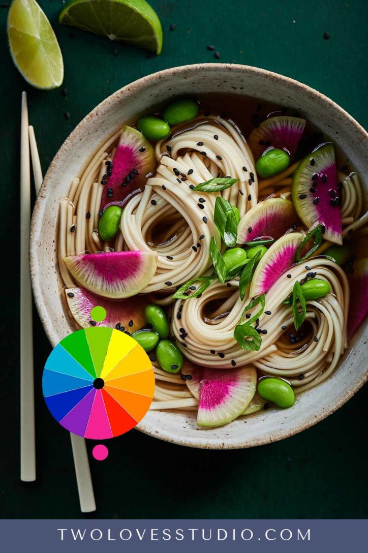
I also paired green and pink which are opposite on the color wheel in this watermelon radish noodle bowl. Now, these two colors, like a warm pink and a cooler green can help to create contrast and allow the pink to really jump off the page.
Monochromatic Color Theory
This is a very special color theory to me. I think it works so well in food photography.
The way this works is we’re going to take one single color and we’re going to use different tones and shades within that one color. Let’s take a look at an example of how I use this in my food photography.
In this particular shoot, I was styling pears, beautiful, fresh pears, and I decided to do a still-life shot. So here we have a different shade of green in the pair and in the leaf.
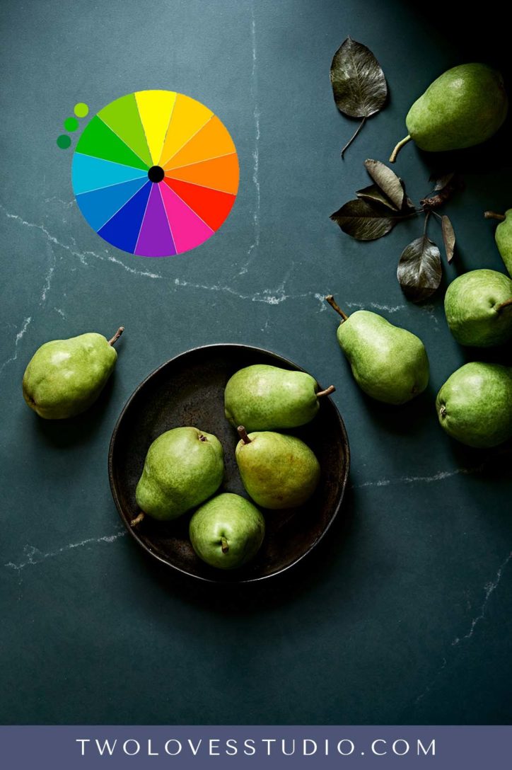
Then in the background, we’re just using one color, which is green, but how colorful does this photo look? Bringing in those different shades can really work wonders if you don’t want to overcomplicate things. Now let’s reverse that.
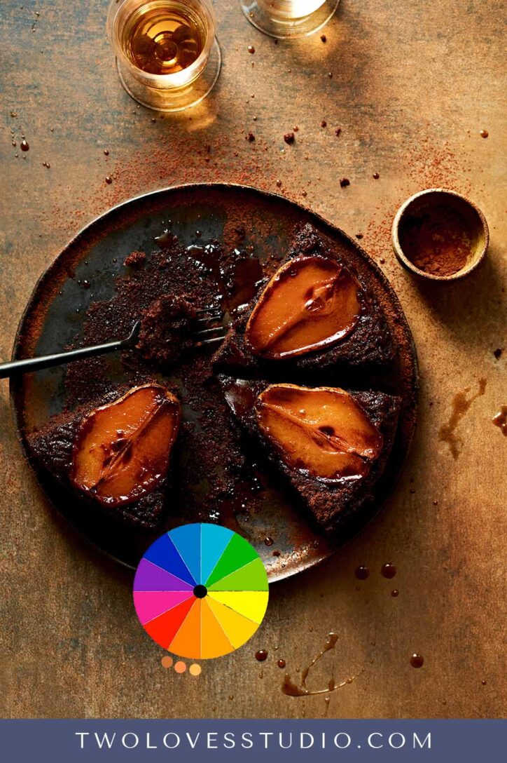
When I cooked the pears in this upside-down chocolate cake, suddenly we are able to change that altogether. We end up with this really warm energising and golden feeling and we’ve achieved this only using one color.
Color theory is really kinda exciting and not so daunting when starting out. I’d love to know which one you’re going to use in your next photo shoot.
To learn more about color in Food Photography, check out my related blog posts:
- Advanced Color Theory: 3 Techniques To Boost Your Color Composition
- Color Techniques Tips and Tricks for Better Composition in Food Photography
- My Favourite Way To Use Colour Theory in Food Photography
- 3 Secrets to Edit Color Correctly in Lightroom for Food Photography



Felix de Vega
Very interesting.I photograph people for about 10 years, so I am aware that the colour palette is important regarding the clothes of the models and the background. I am new to food photography and didn´t think about the food in that way, but, of course, it is the same concept in another situation. Very inspiring! thank you
Rachel Korinek
Colour is so important in food photography indeed! I hope you can take your knowledge from other niches of photography and apply it here.
Mario
Raqel, thank you so much for sharing your experience and your knowledge.
It is very useful.
I would love to buy your courses, but here in South America, punctually in Argentina, the economic situation is not the best.
That’s why I appreciate you generously sharing your knowledge.
Rachel Korinek
Hey Mario! I am so pleased that you are enjoying the content! I know prices are tough in Argentina right now so I am glad that you can get some training for free on the blog. Welcome to the community.