Color techniques is one of the things that draws us to food photography. In this post, I want to share 7 tips that you can use for color when you’re composing your food stories.
If you haven’t already checked out Basic Color Theory for Beginners or the Advanced Color Theory post, make sure to check out those two posts to get a better understanding of what we cover in this post.
Let’s dive deeper into colour tips and tricks so we can really make our food stories sing!
Color Techniques We Will Cover:
- Warm and Cool
- Basic Colour Contrast
- Saturated and Desaturated Colors
- Match Colors
- Color Repetition
- Pair Down Color Theory
- Colors in Nature
#1 Think About Colors in Terms of Warm and Cool
When we look at a color wheel, we could think about colors as being split up into two so we have cool colors on one side, warm colors on the other side. Color theory, however, goes deeper than that.
You can have a green that feels warm or a green that feels cool. This is going to change how your story feels.
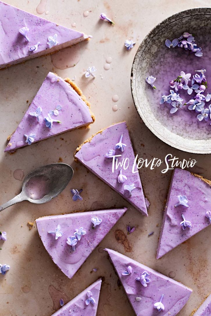
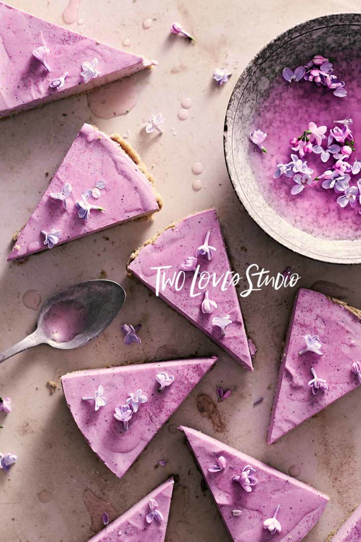
So think about what you’re trying to tell the viewer. Is the food comfort food or is it crisp and cool? Do you want to match cool colors with a feeling of freshness or do you want to have that cozy feeling that is going to lend itself to a warm orange?
Not only do you have to choose cool and warm colors, but you can change that in editing so you can take whatever color you want and you could make it a cool feeling purple or a warm feeling purple, and that’s going to change how the color feels overall.
So really lean into how the color is making you feel. And don’t forget to play with warm and cool tones.
#2 Use Colour Contrast on a Basic Level
This can look very simple, like using complementary colors, which are opposite on the color wheel. Now I want you to think a little deeper and think about contrast itself.
What is contrast? It’s when we have a dark tone and a light tone. We can you use that within color theory to pair a dark color and a light colour together to further enhance the contrast in your photos.
#3 Think about Saturated and Desaturated Colors
This is something that took me a while to get because when it came to color, I thought that rich saturated colors were what was going to make an image. But after a while, I realised that desaturating some colors can be just as powerful.
So when you’re at the editing stage, you can play around with a different saturation of different colors and see how it makes you feel within monochromatic color theory as well.
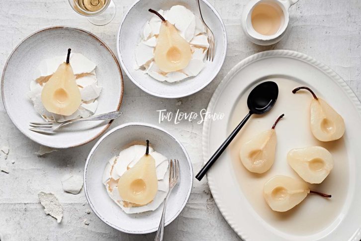
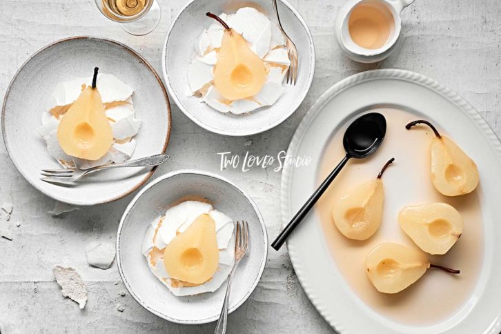
You might want to take a particular color and think about using desaturated tones within that color to further boost your composition.
#4 Match Colors in Props and Backgrounds
One thing I love to do is match props and backgrounds. This is something that Bea Lubas does all the time, and I love that she does this.
In doing this the food itself is going to stand out in a different way. So when I put these things together, I like to pair lighting with the color of the background and the props. So they feel seamless and the food will pop out from the subject.
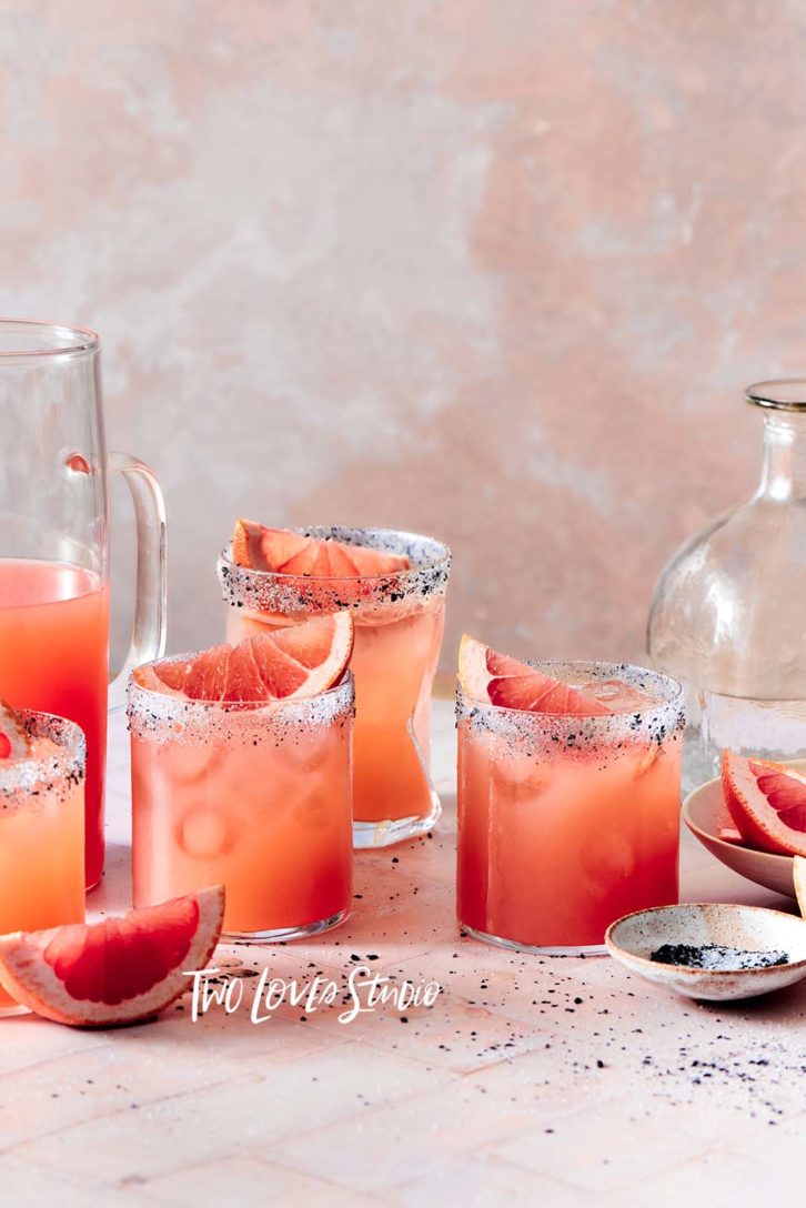
Now I know this can be tough when you’re starting, to have props and backgrounds that match together, but it’s something to think about as you build your collection because it’s a beautiful composition technique.
#5 Think About Color Repetition
How can we repeat the colors that you’ve chosen within your color theory throughout the image?
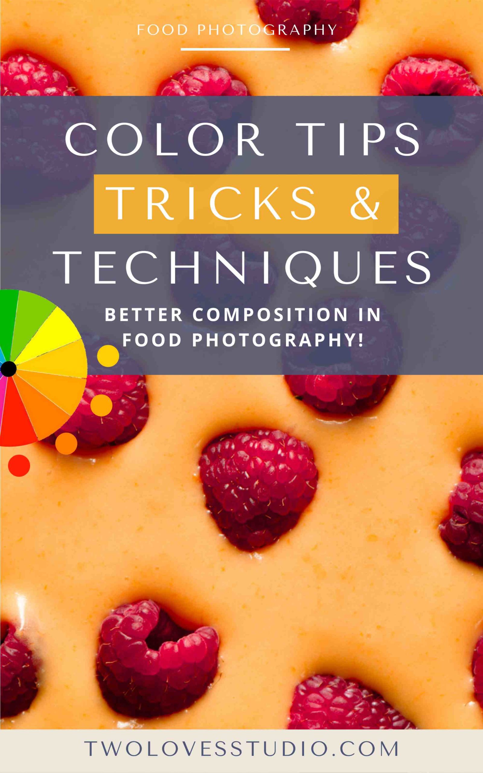
Let’s take of a raspberry cake. We might have the raspberries within the cake on top of the cake, or it could be raspberry jam or we might simply have raspberries scattered across the backdrop.
So, not only is this interesting from a visual perspective, but here we are using color repetition within that subject throughout the frame.
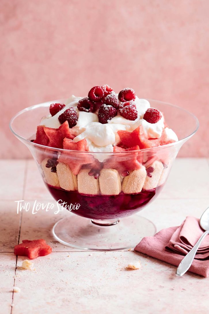
When it comes to editing and color, grading color repetition is going to really help you decide which colors to use when you’re going to grade and tone a photo.
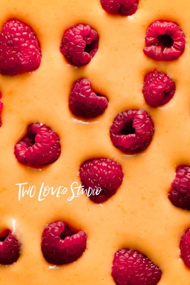
#6 Pair Down Color Theory to the Food Itself
This is one of my favourite tips. I like minimalist composition. and I really like to focus on the details in food. You might be wondering can you think about color theory just at the food stage?
Why not! Let’s say we’ve got a noodle bowl. We’re thinking about the colors that we’re using within that, or maybe you’re doing a show stopping cocktail. Can we use colors within that cocktail so that if you just put that cocktail on its own on a black background, it would be still interesting.
I really like to pair down my color theory to just focus on the food.
#7 Get Inspired by Colors Around You in Nature
There are color pairings everywhere, and a lot of them follow color theory. So next time you’re out and about whether it’s in the wilderness, your local streets or garden take a look at the colors around you.
See if you can determine and name and the color pairings. Can you also think about how you might use that in your work?
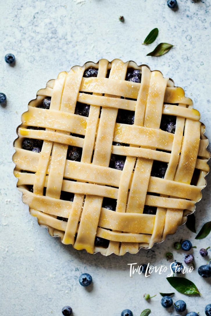
During my time living in British Columbia, Canada I was just blown away by the different tones of blue here and this experience it really allowed me to use those colors in a photo shoot in this blueberry pie.
So never underestimate the colors around you because they are one of our best teachers.
Bonus Tip: Pair Two Colors and Do it Powerfully
I’ve shared a lot of tips with you, but the simplest thing, the thing that I love to do the most is just to pair two colors and do it powerfully. Think about which color theory does that the best for you and what you are looking to achieve. Then you could think about warm and cool colors together.
Think about desaturated and saturated colors. Maybe even just pairing it down to the food itself. Remember it doesn’t have to be complicated. It could be really simple. And if you just lean into how the colors make you feel, you definitely can’t go wrong.
To learn more about color in Food Photography, check out my related blog posts:
- Advanced Color Theory: 3 Techniques To Boost Your Color Composition
- My Favourite Way To Use Colour Theory in Food Photography
- 3 Secrets to Edit Color Correctly in Lightroom for Food Photography


Shotspedia Photography
Amazing Photographs and writing.
Rachel Korinek
Thank you so much for stopping by!